A Guide to Popup Design Best Practices
Following popup design best practices and using a reliable popup builder app make it quite easy to create highly engaging popups for your brand/store.
That's why we're sharing with you the 10 best practices to design a popup that's both visually appealing and persuasive. Additionally, we have included some examples of pop-up designs from different brands to demonstrate how the tips work in action.
10 Tips to Increase Conversion Rates Using Effective Popup Designs
If you are wondering how to improve your popup design, increase your conversion rate and business growth, here are some helpful tips to start with:
1. Identify Your Objectives & Take Action
First and foremost, you should figure out what your goals are. The truth is that your popup designs can’t be accurate if you don’t know what you want from them.
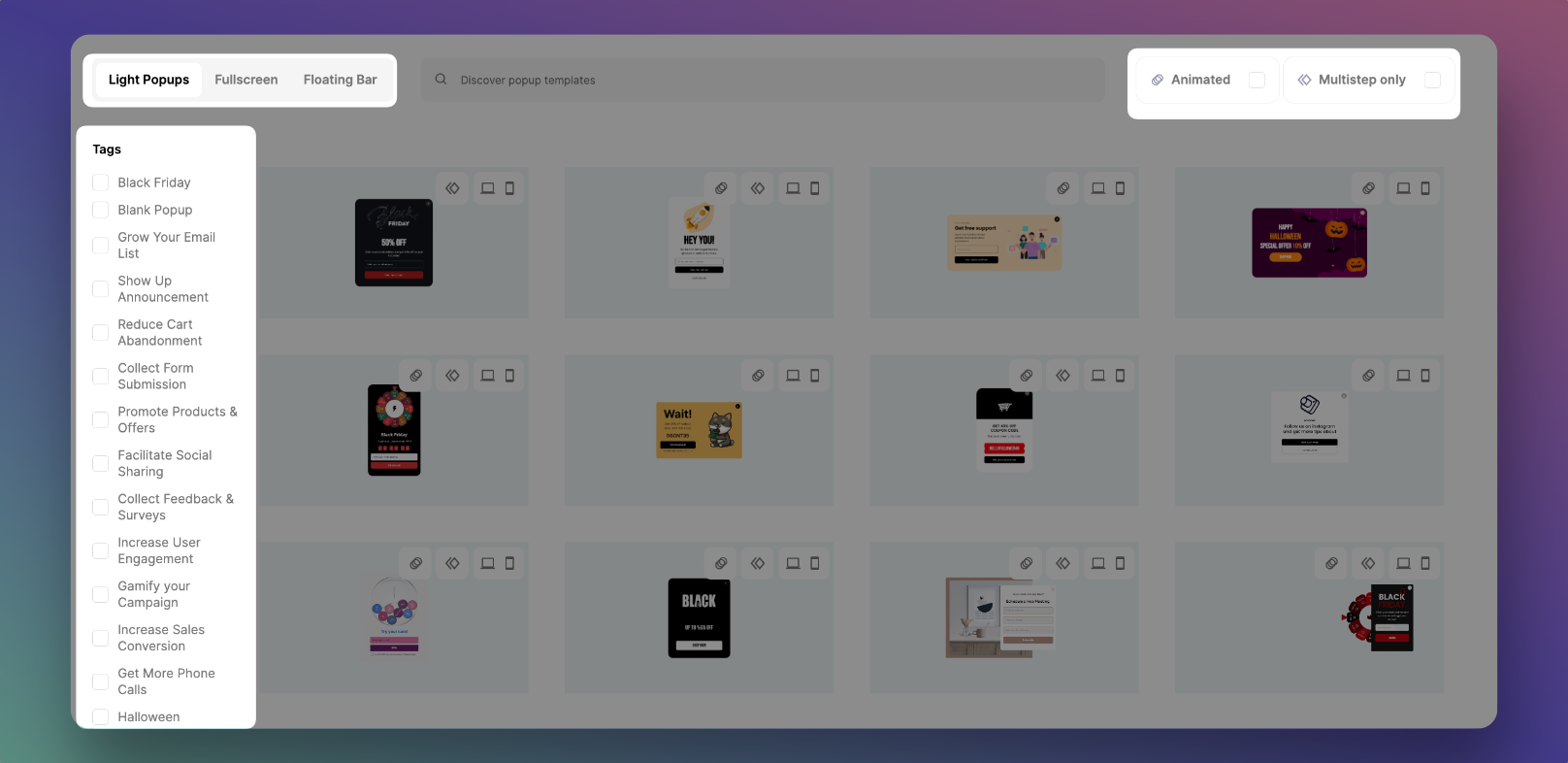
It is important to know your business goals before you start designing your popup so the design can be aligned with them.
You need to identify your objectives and then take action accordingly.
You can have different goals for each popup but follow certain tactics to optimize them for the best result.
- Increasing sales.
- Growing email list.
- Promoting product/service.
- Reducing cart abandonment.
In this article, we will go over each of these tactics and give some tips on implementing them most effectively into your popups, so let's dig in!
2. Make Sure Your Call-To-Action is Eye-Catching
Make it simple yet intriguing!
Your call-to-action (CTA) is the key to conversion when it comes to popup design.
It is the part of your popup that encourages customers to take a specific action, such as entering their email address or adding a product to their cart.
If the CTA isn’t eye-catching, your prospects will most likely ignore it – which defeats the entire purpose of using popups in the first place.
For example, this Hubspot's popup design promoting its blog is a good practice for a converting popup design with a simple yet catchy call to action.
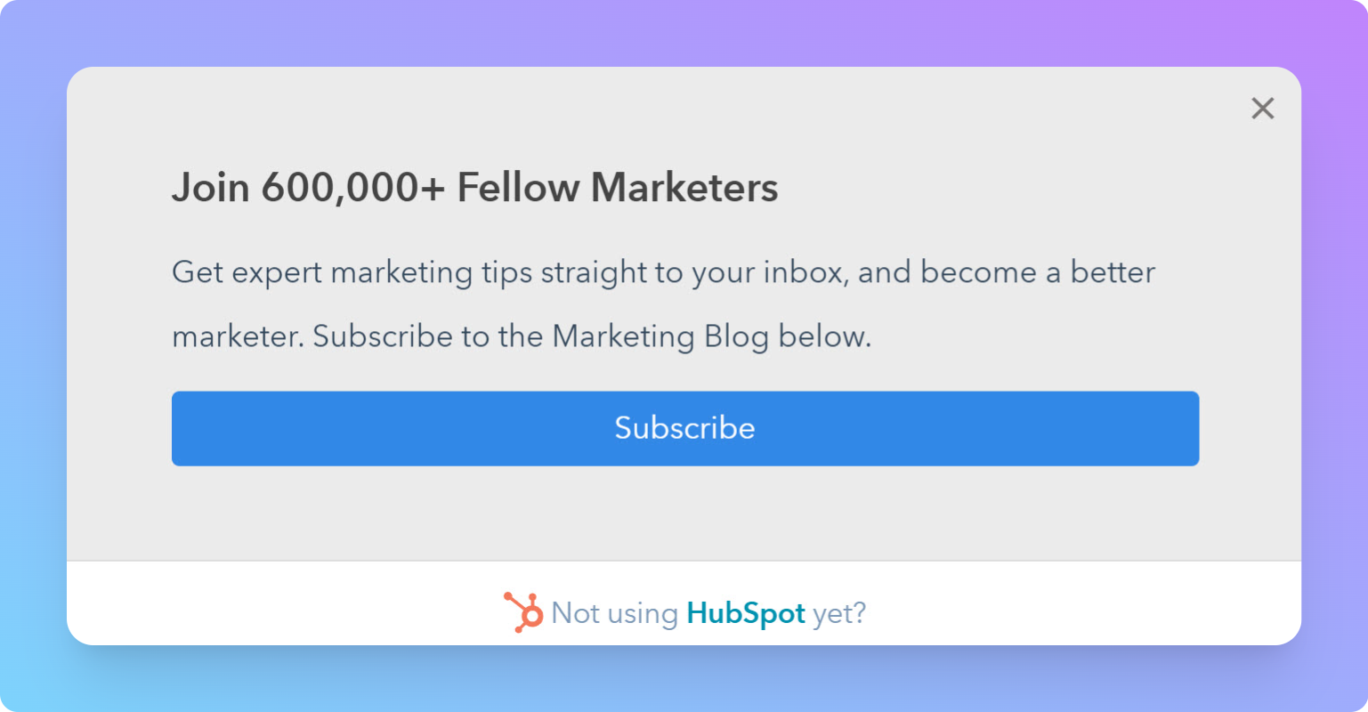
There are a few things you can do to make sure your CTA stands out:
- Use a button instead of text; Buttons are easy to see, and they stand out against the background color.
- Include animations or motion graphics; This will engage visitors and encourage them to take action.
- Keep it brief; Add action-provoking words to make sure that site visitors know exactly what you want them to do.
- Make sure that the button or link is easy to find; You don't want visitors to have to search for it.
- Add urgency; using phrases such as "now" or "today only" can create urgency and FOMO.
3. Be Brief but Persuasive with Your Copy
Say little but say it well!
Since you only have a few seconds to make an impression on your visitor, brevity is essential for a successful popup design.
Be persuasive with your copy; Focus on the benefits of your product or service, and use powerful words to capture attention.
Leverage social proof and community engagement to boost your message, and be clear about what you're offering.
With a well-crafted popup design, you can convince people to take action and improve your conversion rate.
Here is an example of a brief and persuasive popup from Lego. A navigation popup that shows up when you visit its website for the first time invites you to visit the e-store or the play zone.
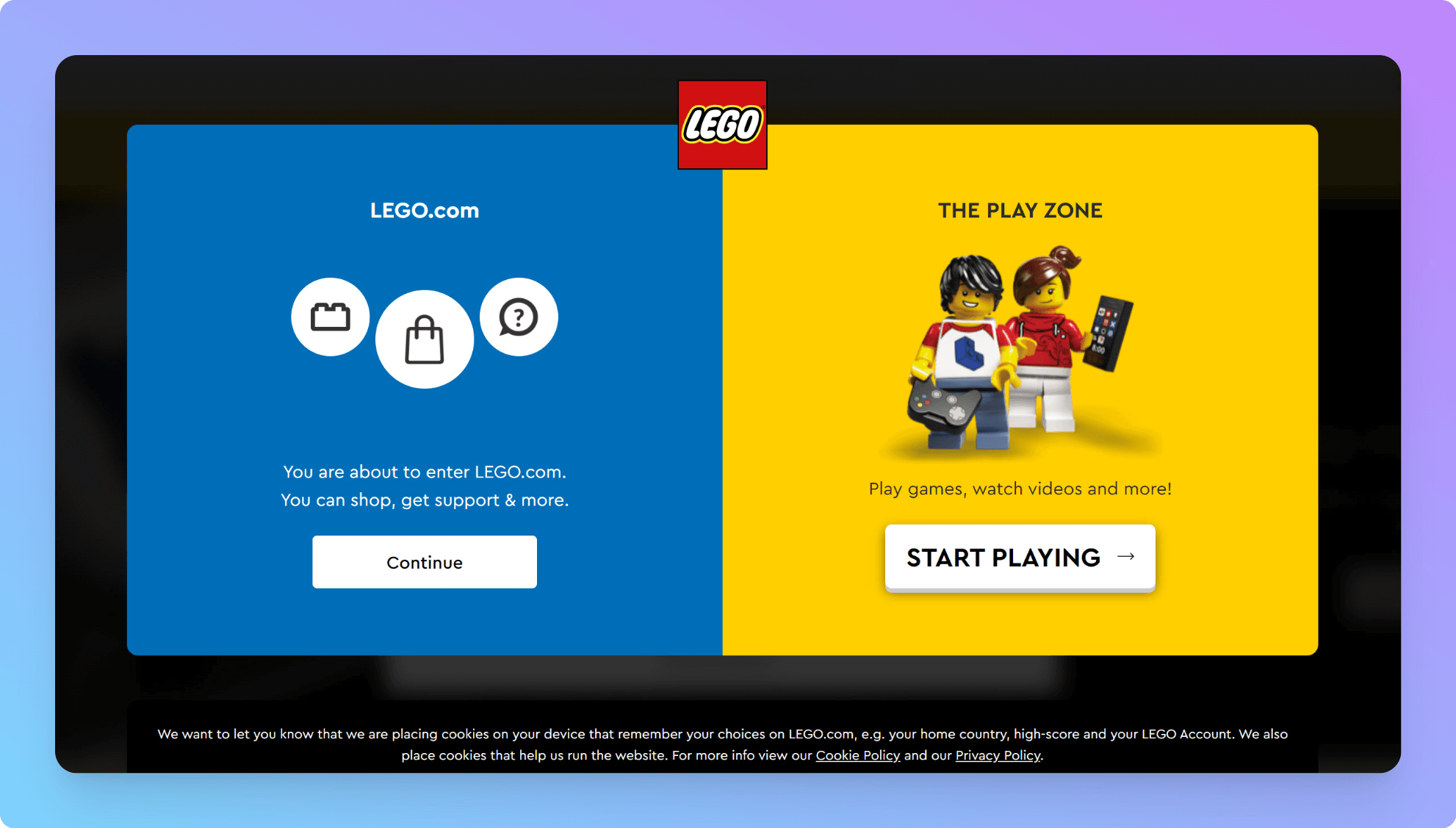
No sales, only useful info and a brief message! Additionally, although the CTAs are different, they are eye-catching and serve the same purpose of indicating direction.
4. Apply Contrast to Draw More Attention to Your Message
One of the best practices to make sure your popup design is seen and acted on is to apply contrast.
Use colors that oppose each other on the color wheel to make your popup's most important element pop out at your viewers.
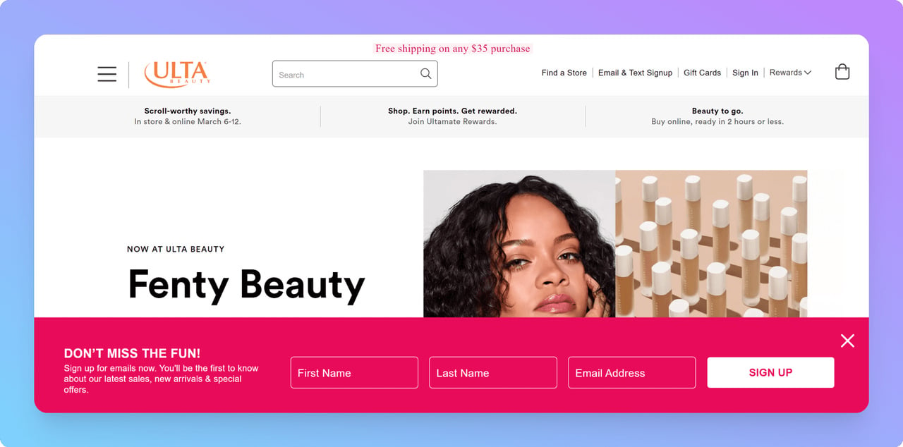
An excellent example of this technique in action is the Ultra Beauty floating bar popup.
The pink color of this popup contrasts the white background of the site yet is in harmony with the website style. Also, the headline "Don't miss the fun!" is brief yet triggering.
So if you want to make sure people see your message, consider using a contrasting color for your call-to-action button or your whole popup.
It may just be the difference between getting attention and being ignored!
5. Use Creative Images and Make the Most Out of Them
Get the most out of the space you have by adding relevant images and different shapes in your popup designs.
You can add cute illustration to hook users and use emotional trigger words to make them take action.
In fact, the more unique a popup is, the more likely it will stand out. Look at the example below:
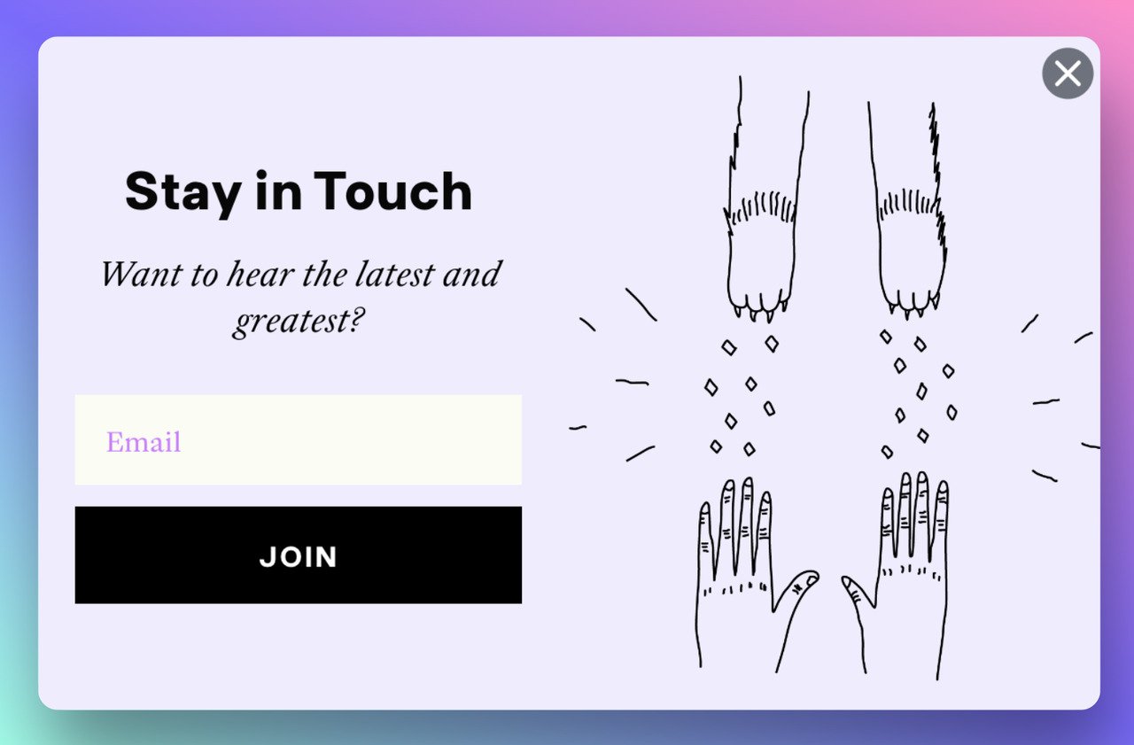
Using related images and graphics are great ways to attract attention and are generally effective at getting people to notice your popup.
Here is another example of COVID-19 response notification popup using related and eye-catching imagery:
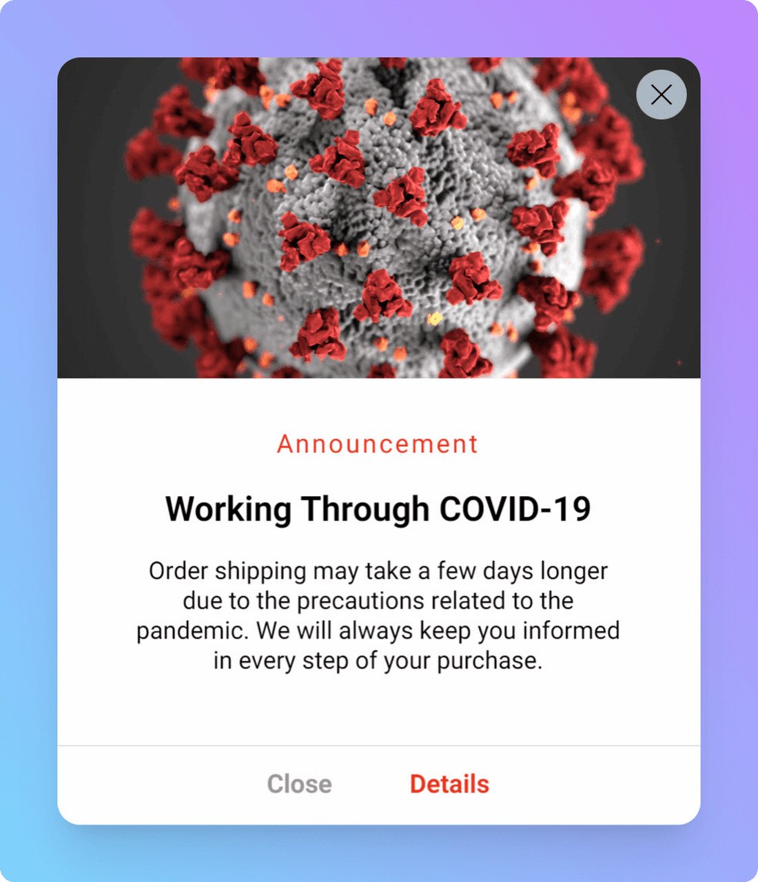
Some good ideas for using images in your popup designs include:
- Images related to the message you want to send
- Images of your products.
- People who represent your target audience or ideal customer.
- Showing your products being used.
6. Adapt Your Popup Design to Your Website Style
Popups can help you get people to pay attention to your message if they're well-designed. However, you must do it with style!
Matching the design of your popup to the overall style of your website is essential for your brand’s identity.
By doing so, the popup will appear more polished and will stand out from the rest of the content on your pages.
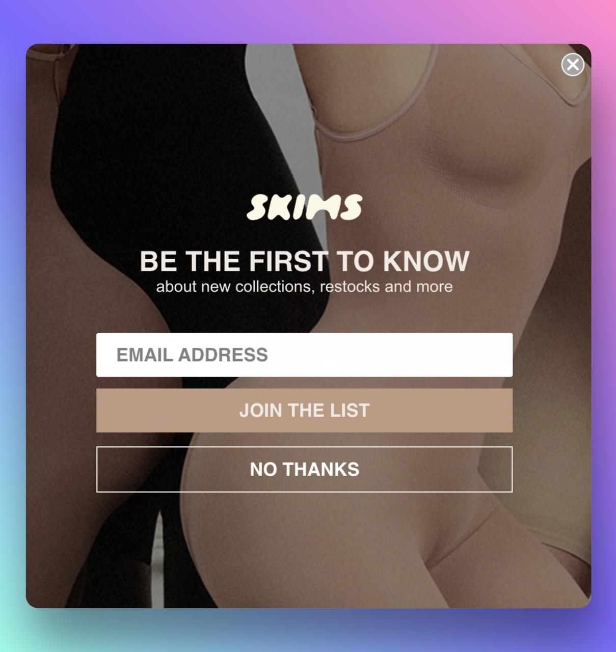
Using Adobe Color, you can create a matching popup design. You can upload a screenshot of your website or the page on which the popup will appear, and Adobe Color simply suggests colors that will work with your site.
Then you can incorporate these colors into your popup's design to create a cohesive look.
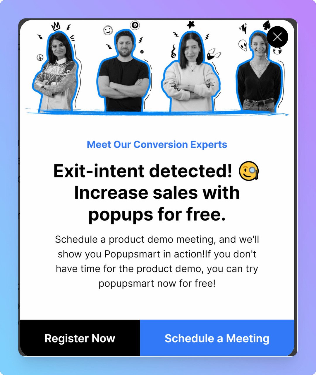
This is an example of Popupsmart's exit intent pop-up perfectly targeting the potential customers and matching the brand's identity and website's style.
The Popupsmart popup builder solution allows you to fully customize your popups so that they match the style of your store.
7. Don’t Ask for Too Much Information
When all you need to contact a customer is their email, why bother them with so many fields?
Reducing the number of input fields on a popup form can often result in better customer experience and engagement.
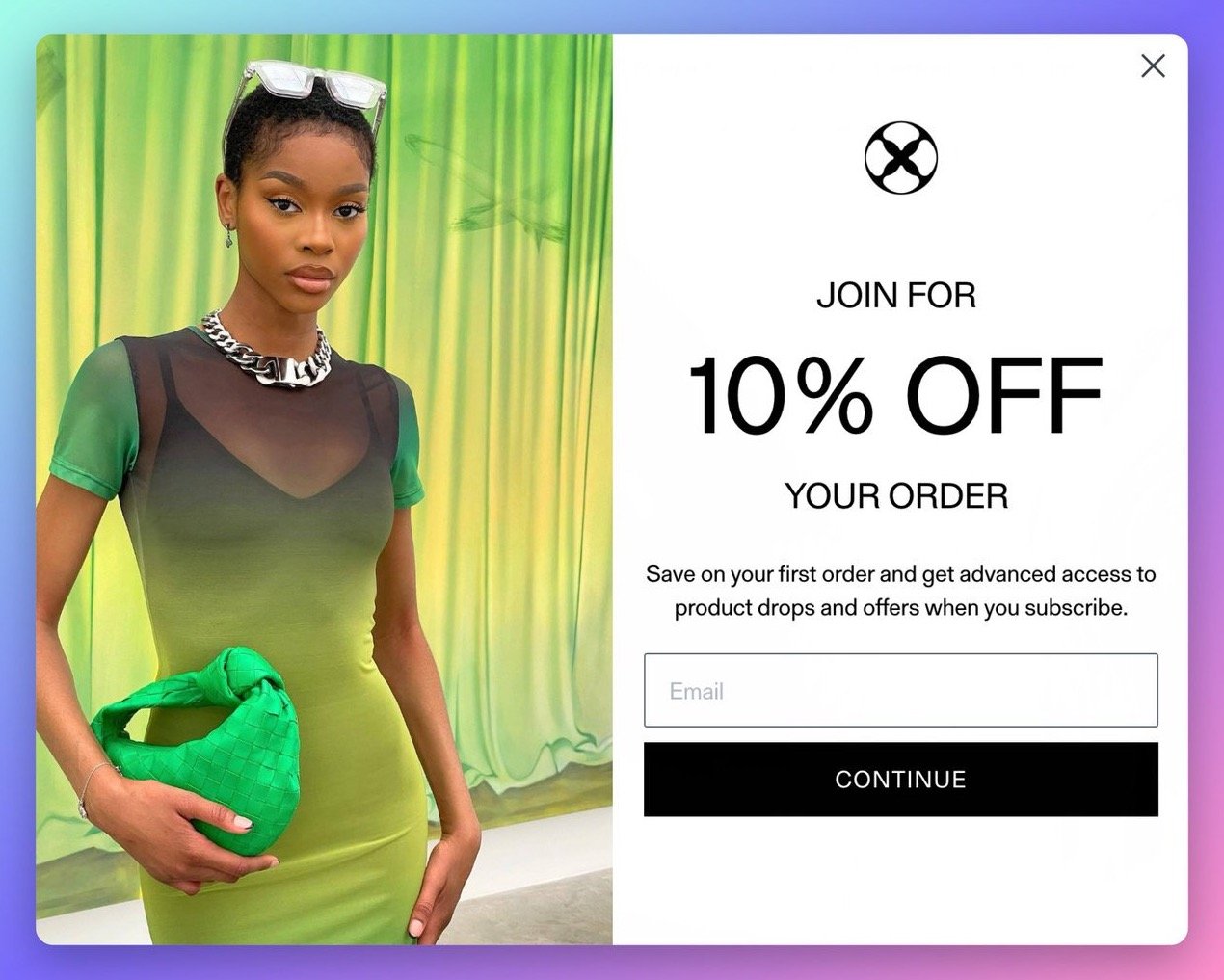
A good rule of thumb is to only ask for the information you need. This will make the your customer journeys easier, and they will be more likely the complete the form.
Limiting the number of input fields on your popup form helps you improve usability and yield better results. Keep this in mind when designing your following email popup!
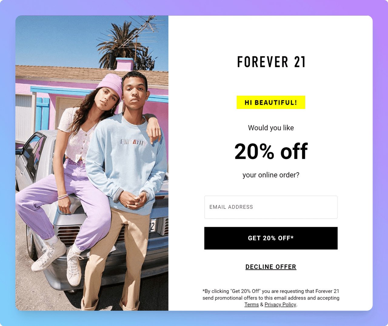
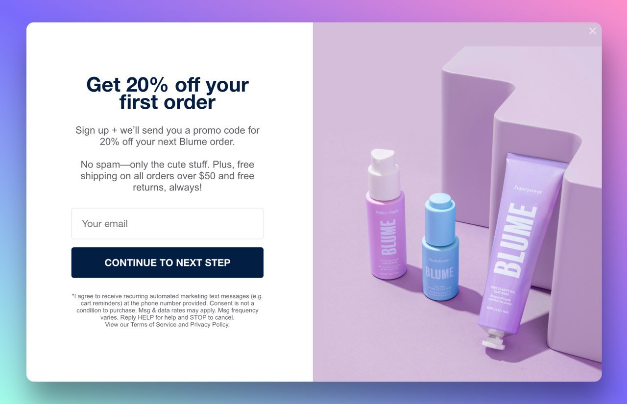
This is a good example; Forever 21 offers a 20% off coupon in exchange for an e-mail address in this pop-up.
8. Make it Easy to Close Popups
It’s no secret that popups can be pretty annoying if used incorrectly. But you know what’s even worse? Hard to close popups!
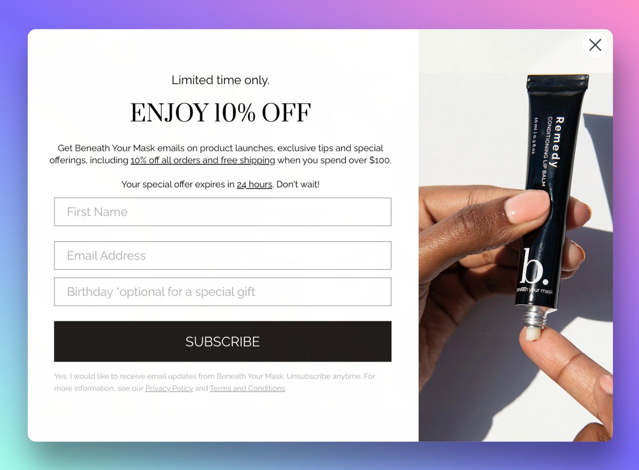
Many marketers mistake using small, unnoticeable, hard-to-click “X”s that frustrate visitors and cause them to leave. Or worse, they decide to abolish the close buttons altogethe, hoping that visitors will figure it out by themselves.
Making it easy for visitors to close your popups makes them keep engaging with your site.
Check out 20 Inspirational Popups Used by Famous Brands.
There can't be an end to people who leave websites just because they couldn't close an annoying popup that kept appearing. Don't risk damaging your bounce rate this way!
With Popupsmart, you can customize the close popup button to match the style of your site while still being accessible for visitors.
9. Create Customized Mobile Popups
As we all know, mobile traffic is becoming increasingly important, and if your website is not optimized for mobile devices, you are missing out on a lot of potential business.
Customizing popups for different devices can be challenging but ensures that all possible channels and audiences are reached.
Since desktop users have a larger screen, you can add more elements to your popup.
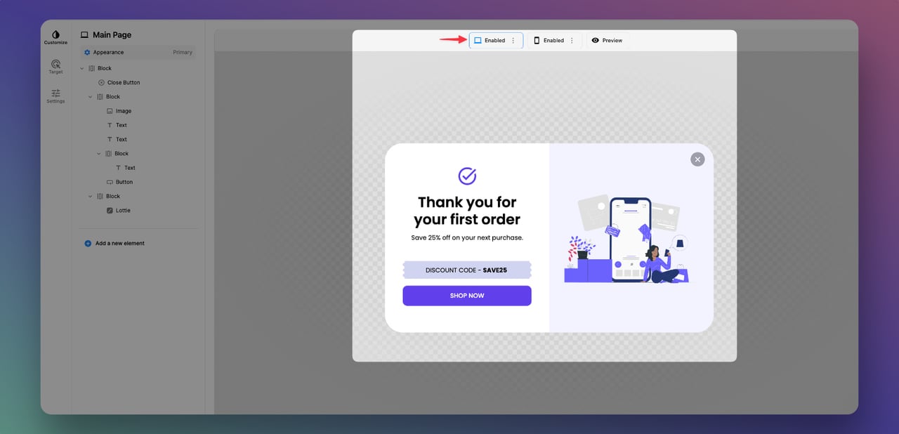
On the other hand, mobile users are limited, so you must reduce the number of factors in your popup.
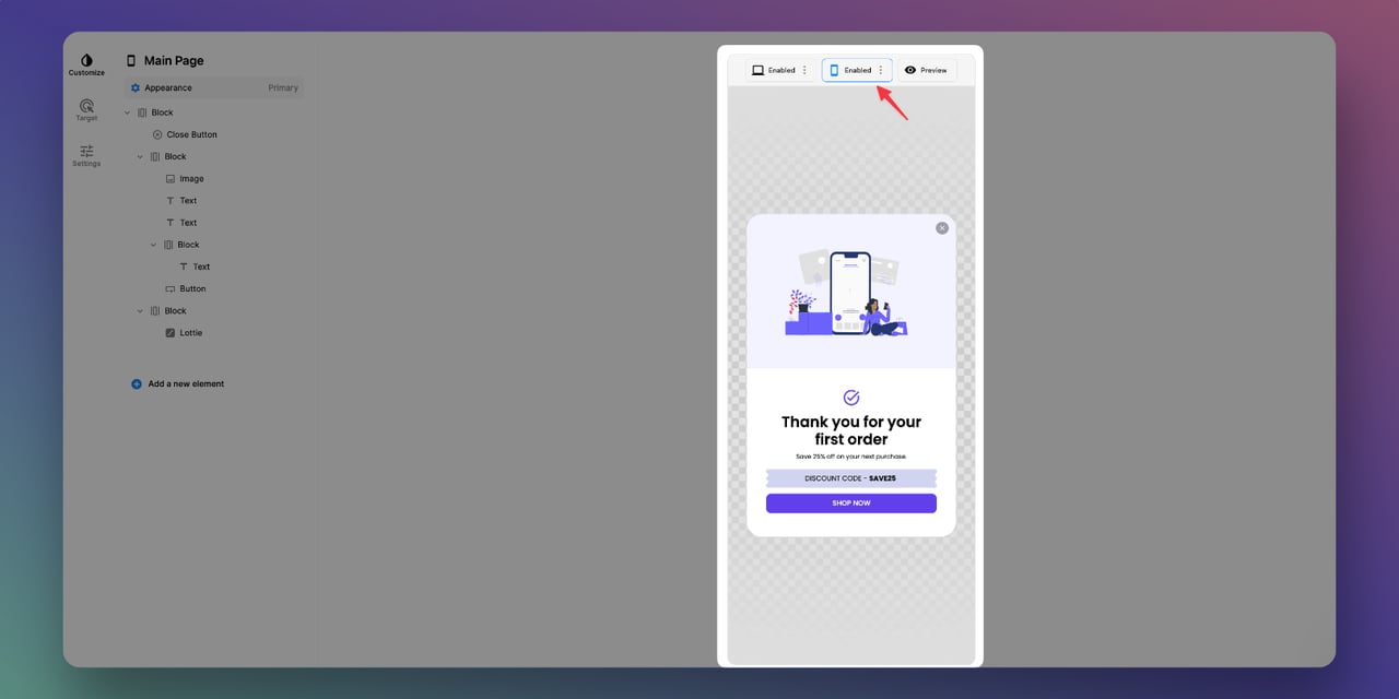
Popupsmart makes it easy toswitch between desktop and mobile view, so you can easily edit the elements that need to be changed.
You can also create separate popups for different devices or use the same design for your mobile popup.
If you want your mobile popups to be fun and engaging consider the tips below to design conversion-ready popups:
- Shorten your popup copy & CTA for your mobile device
- Remove any confusing background images
- Minimize the number of form fields
10. Use Gamification in Your Popups & Entertain Users
Using Gamification, you can integrate game concepts and elements into your popup campaign, entertain users, and influence their behavior.
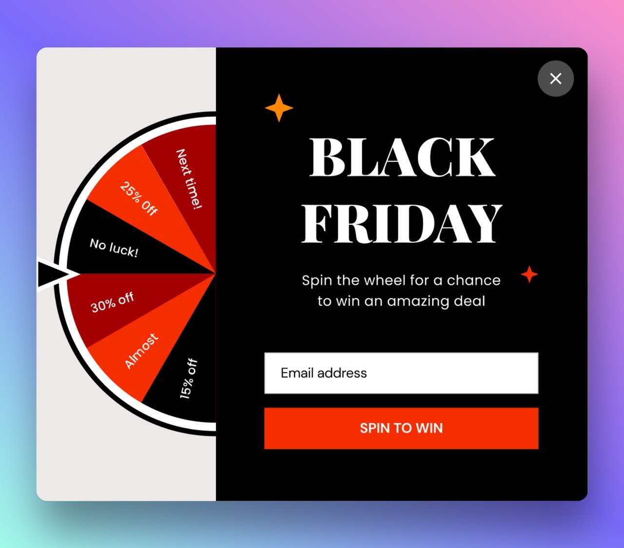
Spin-to-win wheel popups offer the opportunity to turn your visitors' shopping experiences into a game and encourage repetitive behavior.
Using animation along with a good wheel popup can hook your audience and entice them to take action.
A wheel popup is also a great choice for special occasions campaign launches such as Black Friday and Cyber Monday.
Start Designing Your High Converting Popups Now!
By following these popup design best practices, you can create an engaging experience for your brand which leads to happy customers.
Basing your popup on these principles will increase your chances of getting more conversions and ultimately help you achieve your branding goals.
Furthermore, these practices are not difficult to follow, and you can improvise them as per your requirement.
However, it’s better to remember that everything should be geared towards one goal-helping users complete the desired action.
Are there any other best practices you would like to add to this list? Let us know in the comments!
Frequently Asked Questions

How Do You Create Conversion-Ready Popups?
To create a popup that converts first, you must know the best popup design practices and follow them for the best results. One of the most important practices to follow for a conversion-ready popup is to know your audience and customize the popup with an eye-catching image and a short and to-the-point call to action.
What is the Best Popup Size for Users?
Ideally, a popup should not cover the entire screen and be easy to close. Generally, a pop-up window's minimum size is 294 x 150 pixels, and its maximum size is 510 x 424 pixels, but it differs based on the users’ device.; it's a good idea to stay under 900×650.
What are the Different Types of Popups?
You can use several types of popups for your website's specific pages to get the best result. Here are the most common ones:
- Exit Intent Popups
- Email List Popups
- Nonprofit Website Popups
- Cart Abandonment Popups
- Payment Popups
- Sales Promotion Popups
- Social Proof Popups
- Cookie Consent Popups
- Discount Popup Examples
Listed below are some related articles you might find helpful in your research:
- 27 Perfectly Optimized Popup Designs to Inspire for 2024
- Popup UX Design: Common Mistakes & What To Do Instead
- Email Popup: Complete Guide with 15 Brilliant Examples
Related Terms:


