What is Above the Fold?
Above the fold refers to the first part of the website or the screen before you scroll.
This is probably the most exciting part of the landing page because, as we constantly mention the importance of it, above the fold stands for the essential part because the visitors firstly interact with it.
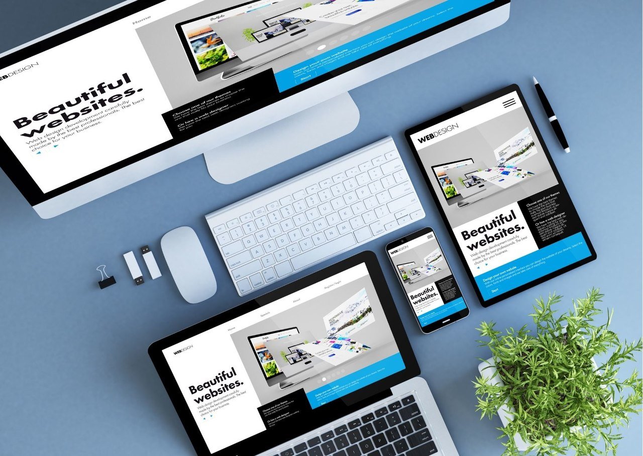
Through centuries, we have witnessed the improvement of above the fold actually; however, moving to digital areas breathes new life into above the fold concept, and we see the websites above the fold.
Therefore, we make our arrangements according to the usefulness and the effectiveness of the website by calculating the time we will spend surfing.
Finally, you should be aware of above the fold effects.
The Top 20 Above the Fold Examples
There are 20 fascinating above the fold examples to open a new window into your mind and creativity.
1. Ahrefs
Ahrefs is an all-in-one SEO tool, and it gives a highly elevated service, both its free tools and its plans with various features.
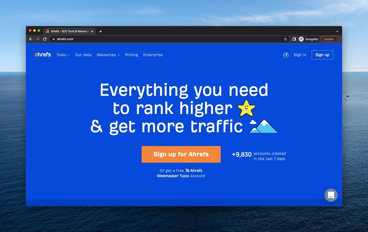
As for the above the fold of Ahrefs is an example of a simple but effective type. The page fits in the borders of a striking blue, the essential aspects on the header, and the CTA button, which calls the visitors to sign up at the bottom.
Also, since Ahrefs is aware of the significance of the words, it directs the visitors' attention by saying, "Everything you need to rank higher & get more traffic." It summarizes the needs and the wishes of the comers.
Another detail is that Ahrefs shares the social proof that belongs to the last seven days, and the icon of the chat box located on the right below leads to the Help Center to conquer the visitors' hearts.
2. Allbirds
Allbirds is a shoe and clothing brand that draws its strength from sustainability and the use of natural materials.
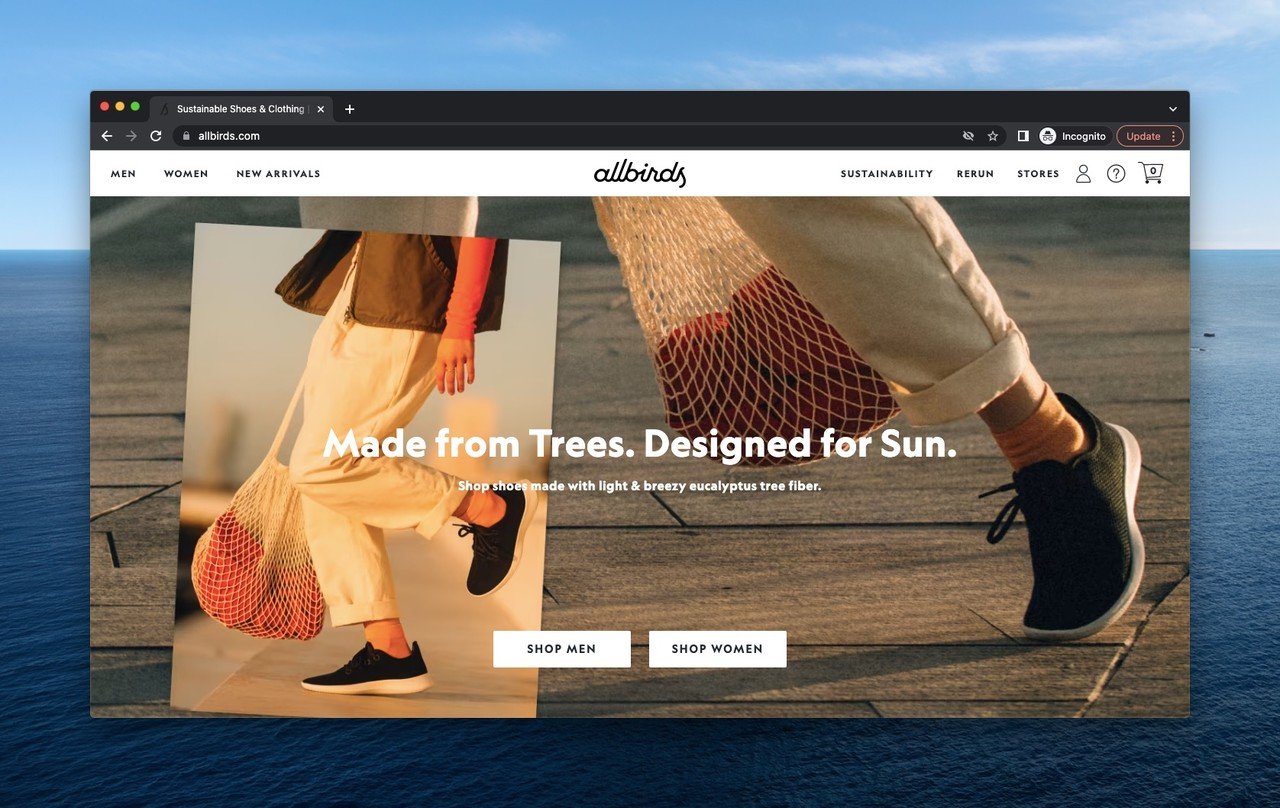
The above the fold of Allbirds is compelling, and when you take a quick look at the header, you will see the necessary buttons symbolizing categories Allbirds has.
Besides, if you look at the right side of the header in detail, there are symbols of profiles, help, and the shopping bag for the visitors to customize for themselves. On the left side, it gives the clue of another collection for the season.
The image it uses gives the quality and the idea of sustainability with the motto it uses. Under the slogan, there are two gender options Allbirds has, and the visitors are expected to choose among them to move among the natural products.
3. Apple
Though everyone is highly familiar with Apple, it is a famous technology company producing various electronic products, online services, and software.
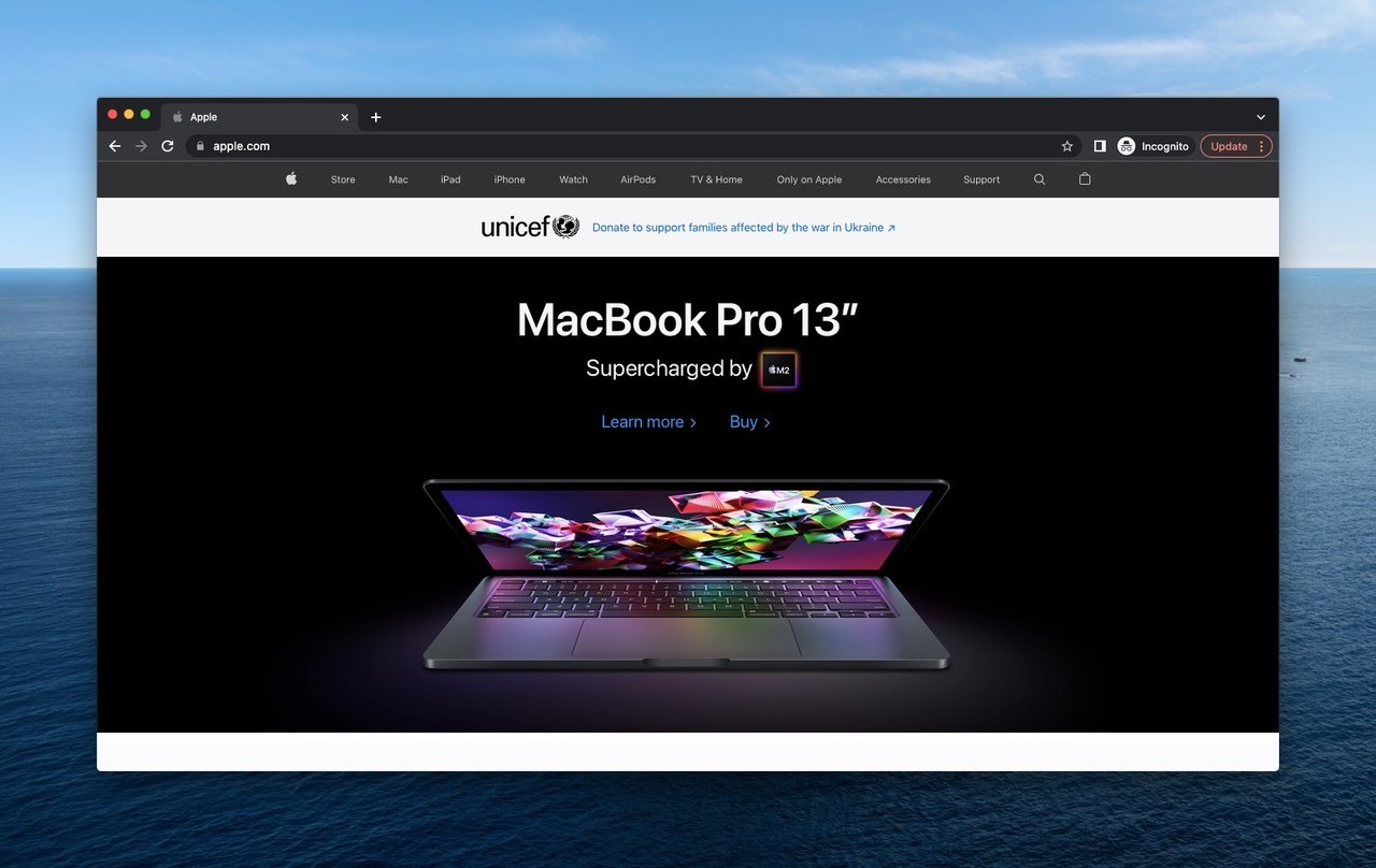
When users first click on the page of Apple, the image in the center attracts their attention. It is done on purpose by the brand to introduce and promote the new product.
Also, it encourages the promotion with the buttons 'Learn More' if one wonders about the new device and 'Buy' if one is willing to buy.
On the header of the page, there are many options related to the features of Apple, which is quite helpful for the visitors to take action.
Under the header, we see the collaboration done with UNICEF for the war victims. The firm wants to emphasize it by placing the statement on the above the fold part in order to show it is a socially-minded brand.
4. Bobo’s
Bobo's is a food brand producing healthy, organic, gluten-free, certified non-GMO, vegan oat bars and foods.
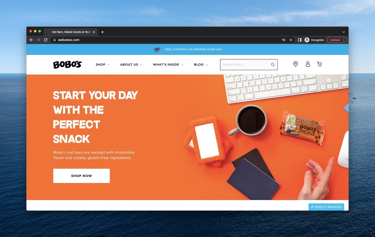
The above the fold of Bobo's gives a liveliness because of the color orange. The designers wisely choose the items to point out the healthiness of the bars.
Next to the articles, the users are informed and put into the center of the action with the 'Shop Now' button.
On the upper side, we examine four categories: 'Shop,' for the buying of the products; 'About Us,' giving the details about the brand and its adventure, 'What's Inside,' showing the ingredients of the Bobo's, and Blog giving the beneficial informational writings for the consumers.
Above the header, we can see a campaign suggesting free shipping if the visitors decide to buy some products.
Also, the slight but effective detail is the Bobo's Rewards button located on the right below. It leads to rewards when you make a purchase and have various advantages. It can be commented on as a strategic move, but it is absolutely powerful.
5. Calvin Klein
Calvin Klein is famous for its underwear, handbags, clothing, and home furnishings that are considered contemporary.
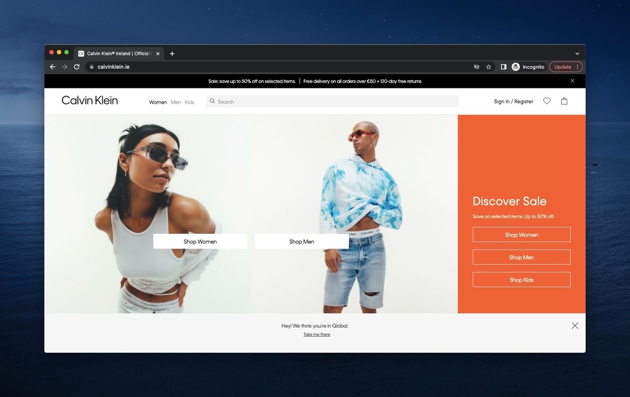
Calvin Klein also prefers a differential but direct above the fold page. The separation of the page is the first thing that attracts, and at the very top of the page, Calvin Klein announces the sale opportunity.
On the same row with the logo of Calvin Klein, there are categories, a search bar, and the options to customize for each user.
Throughout the center, two figures wearing the brand promote the products. Next to figures, the page offers three options for shopping as another clever step.
In the end, there is a bar leading to another page, yet calling the visitors is an interactive choice for the above the fold when we emphasize it is the most powerful tool to impress.
6. Dyson
Dyson is a multinational company dealing with different technological housing devices and innovations for the future.
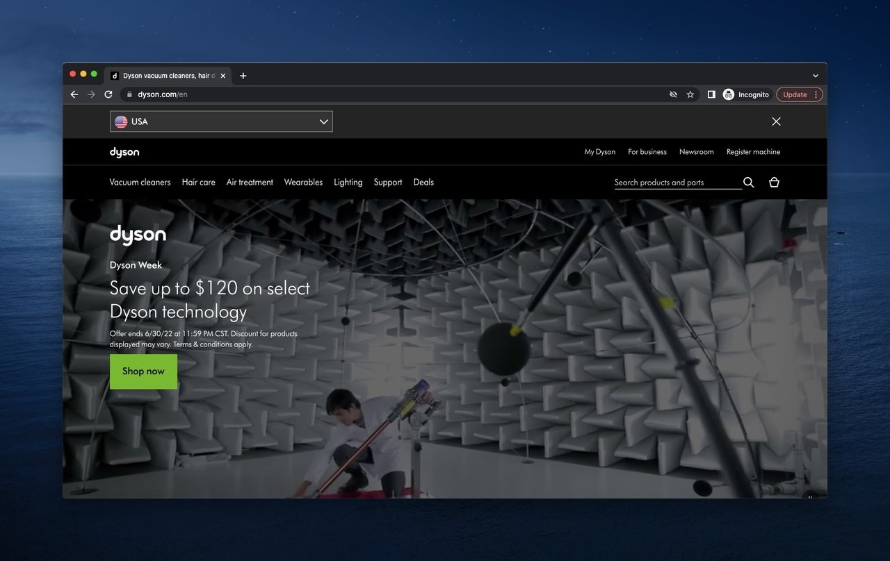
Although black is not a bright color, we know that it is assertive, like Dyson. Therefore, the header and the titles are pretty enough and intriguing if a person even clicks the page on purpose.
The website arranging the products based on the location presents an animated visual content because its primary aim is to display the improvement and the way it has gone through.
Above the fold page also shows the search bar and the opportunity prepared by Dyson to customers with a CTA button since it is a crowd-pulling brand name.
7. EyeBuyDirect
EyeBuyDirect is a glasses company producing many types of glasses, even prescription, and non-prescription ones.
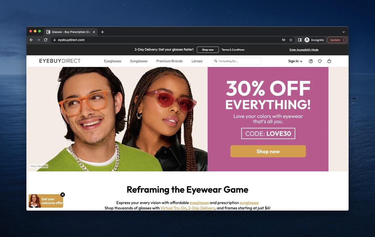
To affect the customers with fast delivery and CTA is crucial, and to back them up with popups and notification boxes gives the concept of making the visitors involved in the page.
EyeBuyDirect has a user-friendly header like the previous names and uses the visual help at the center. The figures in the image wear the glasses of EyeBuyDirect, showing one is serious and the other is quite happy; the brand refers to the availability of moods with EyeBuyDirect.
The brand supports the visuality with a campaign code specialized for a period of time.
On the left below the screen, we see a welcome offer for the ones who have come to visit for the first time, and there is a statement about the brand's products.
The statement can be regarded as enough at first because the ones who want to learn the usefulness of the brand can have the gist from here.
8. FOMO
FOMO is one of the most famous and valuable social proof tools to use for businesses to attract visitors and have a higher conversion rate.
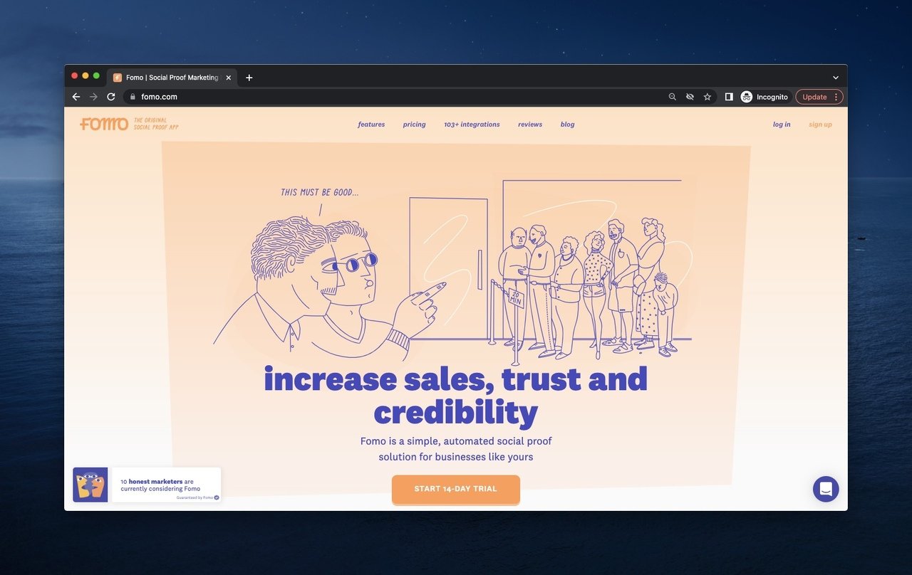
FOMO places the logo on the left top side as usual and adds an explanation to be more precise because FOMO itself has a meaning' fear of missing', as you may be familiar with.
The header is for the categories in which FOMO can lead, and these are the most important ones when a business comes to see what FOMO has.
If you have a profile to log in, you can log in; however, FOMO does not force you to do it because you can comprehend the fonts, and the style is highly casual and even cool.
At the center, there is an image of what social proof is with a proof :) The page both explains the thing it has been doing and calls the visitors to take action with an opportunity to have a free trial.
9. Fossil
Fossil is a fashion brand with many items related to accessories, and it has many sub-brands.
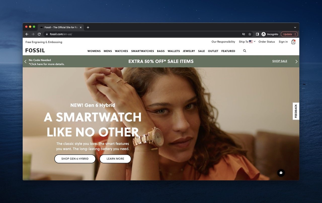
Fossil presents an interactive above the fold with a commercial shoot to show the liveliness of the brand. Also, it introduces the Gen 6 Hybrid, newly put upon the market, by offering two options to learn more about them and buying it with buttons at the center.
Another detail to remark is that the page profoundly highlights the campaigns because of the seasonal reasons, and they have a lot to offer in this sense.
The header can be one of the most useful headers among all these above the fold's headers because it shows the options before you click, and the visitors can choose the one it wants.
P.S: Fossil wins another point with the part above the header because it shows the responsibility of the firm, the order status of the customers, profile pages, and most importantly, the option of shipping locations.
10. HubSpot
HubSpot is a successful software company in inbound marketing, sales, and service software per se. It is the jack-of-all-trades in a way.
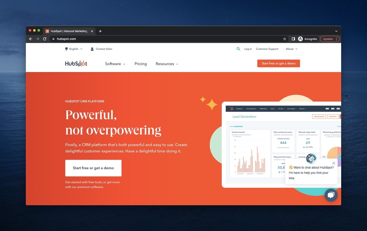
When you visit HubSpot, the chat box welcomes you at first and offers help if you need it. The general view of the page consists of the color red, so it inspires you to take action for your business.
By offering free and premium options, HubSpot gives visitors the details about itself to make things clear and invites them for more information.
The header part hosts many choices, including the language options, contacting sales and customer support, profile, and about pages.
Besides, you can easily reach the details of the software and the pricing options, which increases the quality of the user experience.
11. Instatus
Instatus is a valid status page tool with an intriguing above the fold and other practical features to prevent downtime.
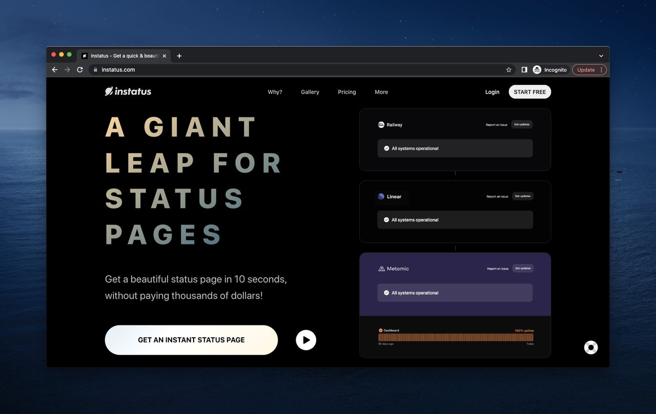
Above the fold of Instatus may seem dark when you compare the other above the folds. However, the important thing here is the user-friendliness of the page. Therefore, we can make inferences that Instatus gives the items needed on the screen.
It is impossible to realize its motto of it and see the interactive boxes used to have ideas about the company. After seeing the features, you can sway toward getting an instant status page at an affordable price.
The header is simply designed for why one should use it, how it works to show on photos, how much it needs to be paid, and more. If you follow the line, you can still witness the Instatus's effort to include the visitors by calling them to start free.
12. Kylie Cosmetics
The cosmetic brand built by famous figure Kylie Jenner produces clean and vegan makeup and skincare products.
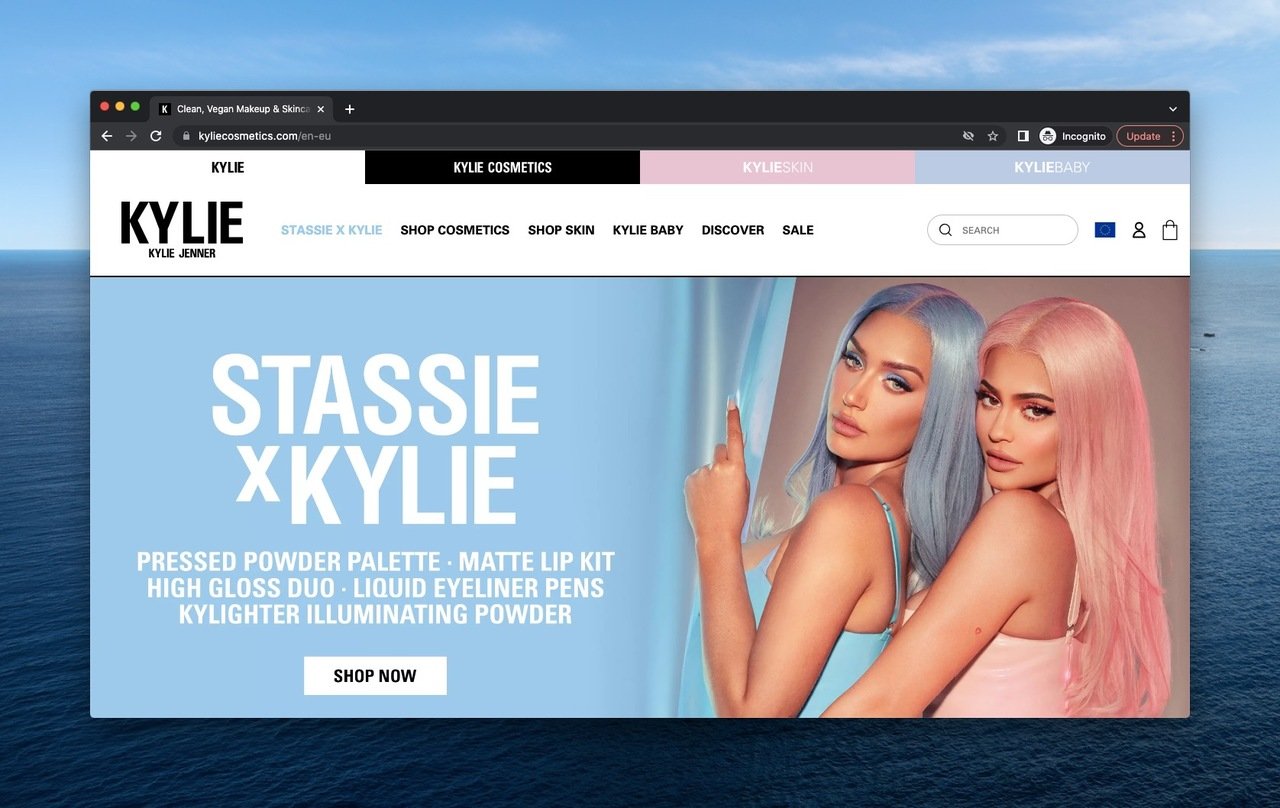
On the top of the above the fold of Kylie Cosmetics, there are sections dealt by the brand to choose the fields you have an interest in. According to your choice, the sub-sections vary, and only the search bar and profiles remain the same.
Since the company carries out a collaboration with Stassie Karanikolaou in the current days, the main focus is given to this, and a considerable part of the page is arranged for the features of this cooperation with a CTA button.
Also, as the faces of this brand and the cooperation, the owner, Kylie, and her partner in collaboration, Stassie, have a photo above the fold.
13. Little Caesars
Little Caesars is a famous pizza brand that offers customers various fried food options besides pizza.
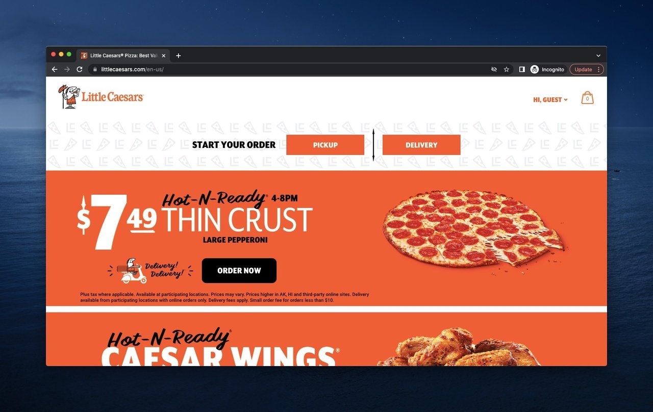
When you are hungry, nothing can stop you or distract your attention, we guess, and to consider Little Caesars' above the fold is quite simplistic since it uses the necessary details but nothing else. It is so probable to evaluate it as highly handy.
The page welcomes you with 'Hi, Guest' and shows what is in your shopping bag. However, what is more significant here is the campaigns it offers, and Little Caesars displays the most affordable and appealing ones at the center.
To start your order is more straightforward than all of these, and you can choose the options that fit best for you. Do you prefer pickup or delivery? Choose to eat right now!
14. Melula
Melula is a children's fashion brand that focuses on shoes and shoe accessories.
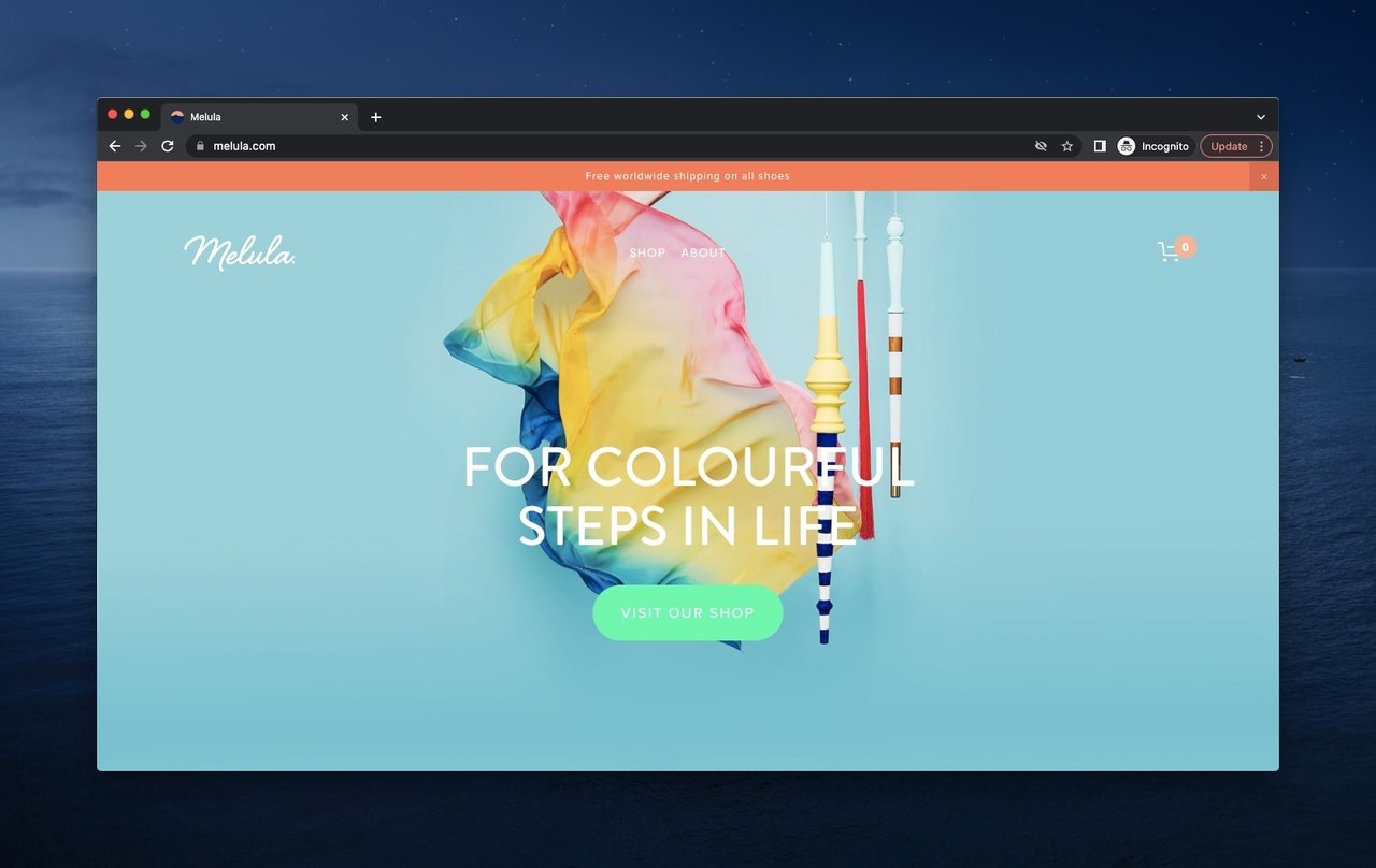
Melula's above the fold is the most simplistic and colorful one we put on this list. Like the innocence of childhood, the brand uses mild tones and the items to make itself understood.
Its message is genuinely explicit, and making the visitors take a step on the page can be provided with the brief CTA button.
The chance of free worldwide shipping is emphasized at the top of the shop and about pages under this.
15. Oskar Gydell
Oskar Gydell is a jewelry business founded in Sweden working to produce hand-made and unique jewels.
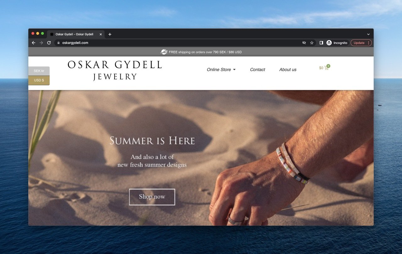
Different from the other above the folds, Oskar Gydell offers the currency options based on your location and gives these details on the header.
It offers free shipping if it is over $86 USD. Besides, you can see what the online store provides before clicking and choosing to continue shopping next to contacting and the 'About Us' page.
Since we are in the summertime, we do not fall in sadness and see the promotion of Oskar Gydell with its jewels because above the fold displays it with a purist image and call to action.
16. Popupsmart
Popupsmart is an easy-to-use no-code tool for building popups and increasing the lead generation of the businesses that use.
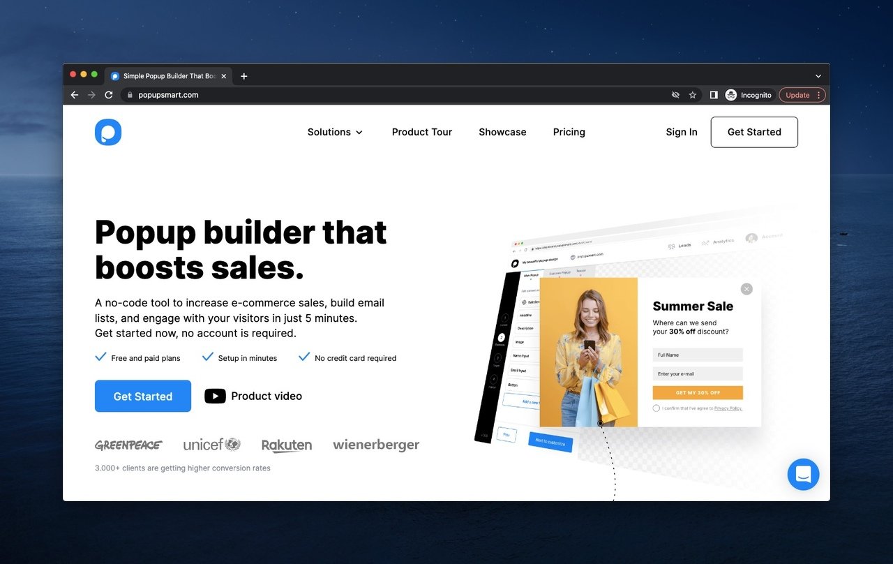
The above the fold is designed as goal-oriented because the more details the brand gives, the worse the situation can get.
Hence, Popupsmart shares the necessary features and the promises to a user with the names like Greenpeace, UNICEF, Rakuten, and Wienerberger, using them as social proofs.
Next to the information needed to get familiar with Popupsmart, we see the promotion of summer sales with an example of a popup aiming to generate leads because the visitors should know what they will deal with.
As for the header, simpleness is achieved as well with only the needed information such as solutions, the product tour to make things easier, some showcases to guide, and the pricing. Later, you will see the 'Get Started' buttons for being a part of the action.
17. Shopify
Shopify is one of the most well-known ecommerce software and a shopping platform for many distinct names.
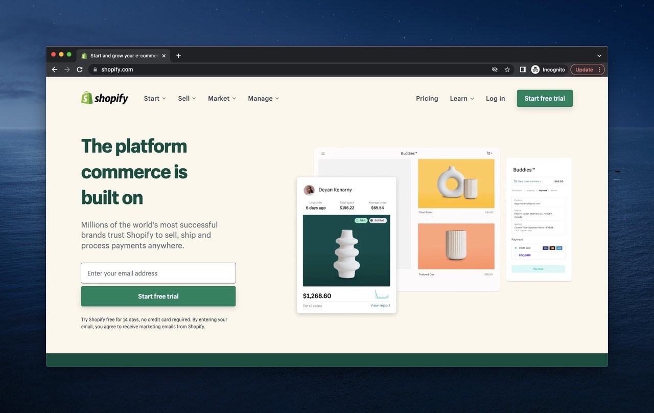
More than this could not be shown for Shopify. And yes, we are talking about the shopping bag. It is the complete summary of the brand because, as an ecommerce platform, it both shows the products and the details and the issues that Shopify is able to do.
The header of Shopify is quite enough for the ones visiting the website with a purpose and leads them to direct sections.
As for the explanations, we see a similar method with HubSpot and Popupsmart as an effective way of introducing themselves to the visitors and inviting them to share their email addresses to start a free trial .
18. Tesla
Tesla is a company founded by Elon Musk, and it deals with the automotive industry and clean energy.
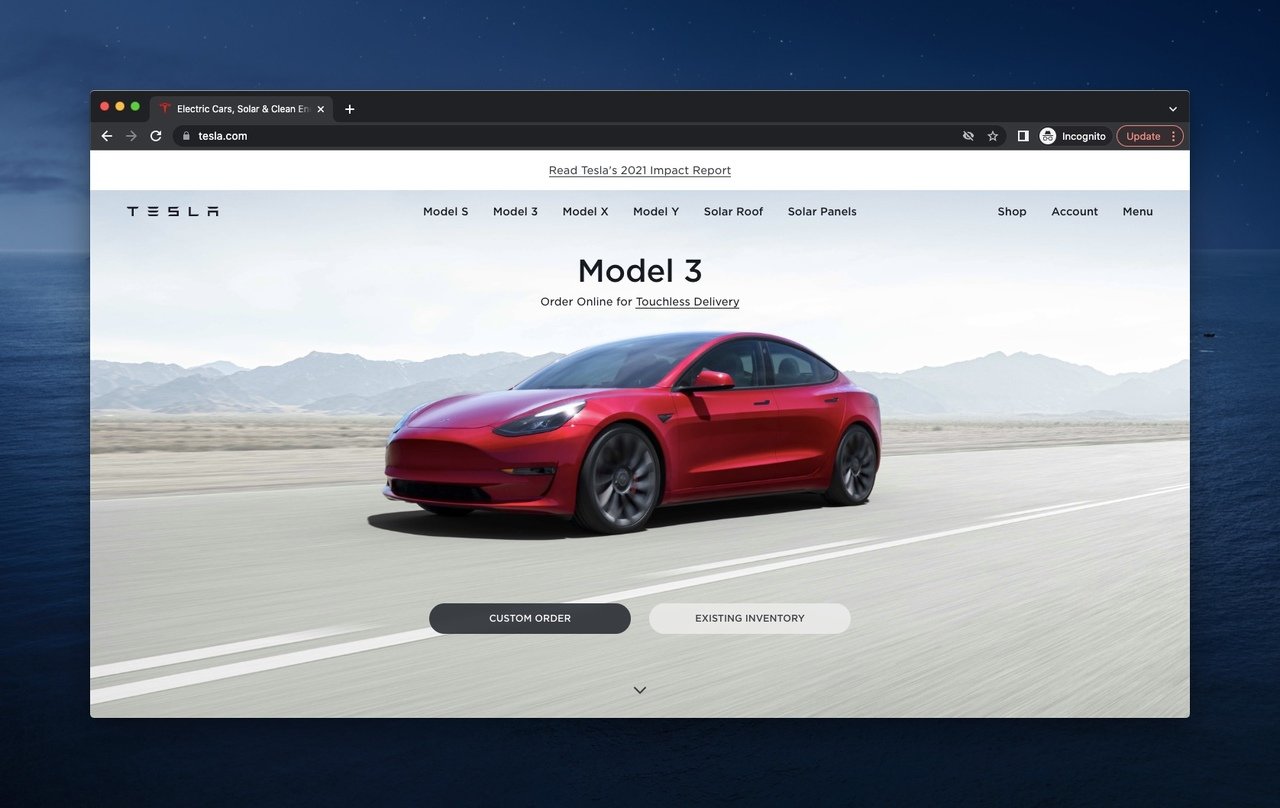
We can say that Tesla and Apple share the same method of introduction because the new model of Tesla, Model 3, is promoted at the center of the page. Besides, it is possible to custom order as you like or see the existing inventory.
When we move to the top of the page, we see a very useful header with different options on the above the fold since it introduces other models and qualities.
To exhibit the environmental conscience it has, Tesla shares the 2021 Impact Report with its visitors, which we find assertive and fair.
19. Walmart
Walmart is a retail corporation consisting of different kinds of stores for the consumers, headquartered in Arkansas.
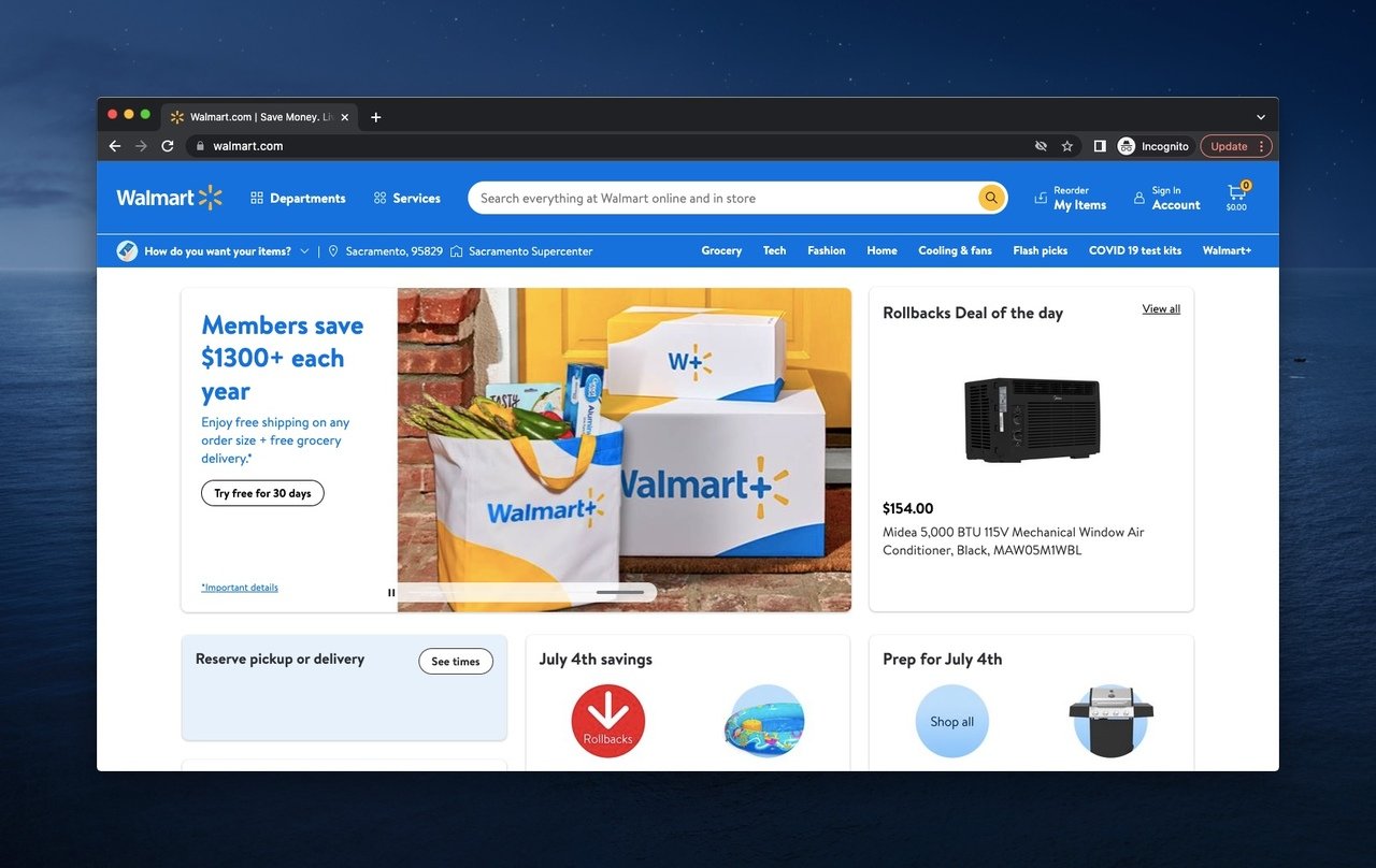
One of the most crowded above the folds is Walmart's. However, it is not a bad thing if you run a retail corporation because you need to show the visitors what you have.
It offers categories on the header and lets you elaborate it based on your location, needs, and dates.
Walmart also presents an interactive part at the center because as time goes on, new opportunities, sales, and discounts exist for the consumers.
It can be regarded as one of the most user-friendly above the fold pages despite its crowdedness since everything is where it needs to be.
20. Zapier
Zapier is famous for automation and integration, which many brands want to have for better management of their businesses.
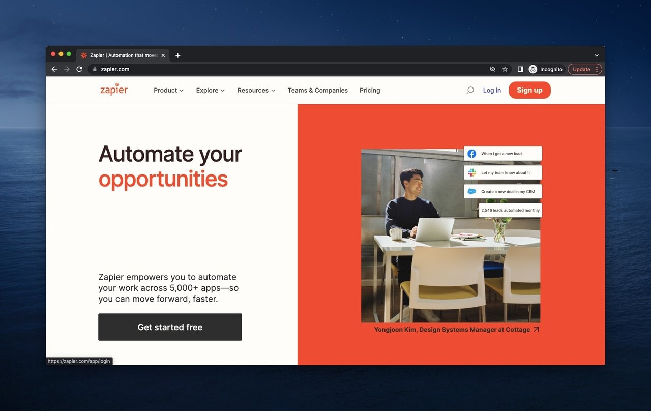
Zapier's above the fold locates the visuality on the right part as well and supports it with explanations just next to it to keep the visitors' focus at the center.
Also, with an animated automation part, Zapier shows that it has authority in the automation field. It offers automation promises by calling the visitors to action with a button as always.
The header fits with the rest of the page since the firm follows a simple and effective way of keeping the visitors and maintaining a helpful atmosphere moving through the page.
FAQ
Do you have any questions? Let's answer!
How Should an Above the Fold Example Be?
There are some criteria you should be careful about as follows:
- Simplicity is the best, do not create any complexity.
- Be crystal clear, do not beat about the bush.
- Avoid using long quotes and texts.
- Use images and visual help.
- CTA will help your visitors take action and arrange your buttons accordingly.
- Create a user-friendly and engaging above the fold.
Why Do You Need a Good Above the Fold?
Because if you do not care about above the fold, you will have to increase your conversion rate and user engagement.
It also gives the idea of how much you care about your product and its promotion to the visitors.
It would be best if you remembered that the visitors want to feel fascinated and valuable. If you skip this detail the above the fold, that will create a wrong impression about you.
Why is the Above the Fold More Important than the Below the Fold?
Because above the fold firstly greets the visitors and creates the actual impact. Below the fold, which refers to the later part of the page, is the second step during the surfing process. That is, below the fold is the second rank in importance, and you see it when you scroll down. You can also say that below the fold is not a causal factor for the visitors after they are convinced that you are professional.
Wrap Up
Though we deal with the whole page, the above the fold is the first thing that attracts the attention.
Therefore, it is really important to give importance to have an effective above the fold page.
We hope that you enjoy the examples and they might be the inspiration you are searching for your website.
Other Inspirational Blogs
If you want inspiration for your business, you can take a look at these as well.
