What is a SaaS Landing Page?
A SaaS landing page is a sales page aimed at cold-selling your product or service to your website visitors. SaaS landing pages are used in the products and services marketing strategy where users are asked for an immediate sale without any prior purchaser contact.
A SaaS landing page is a page on your website that an interested visitor can land on to find more information about your product. It’s designed to promote or sell your software online. It doesn't necessarily have to be related to the actual application, but it should provide information about how it works and what benefits it can provide.
The most important factor in creating a good SaaS landing page is understanding your audience. What are their needs? What will motivate them to purchase? What do you want the end result of the page to be?
After you've answered those questions, you can create an effective SaaS landing page that both inform potential customers and encourages them to convert into leads, contacts, or even customers.
What are the Benefits of Using a SaaS Landing Page?
- A landing page is essentially another website, which means you have much greater control over the conversion process.
- You can set up a design template for your page, which presents visitors with all the key information in an organized manner.
- Landing pages allow you to create a seamless path for visitors who are interested in buying your product. They are designed specifically for this purpose and are focused solely on making conversions.
Good to Know: The average conversion rate of a landing page falls around 2.35%.
What to include on SaaS landing pages
- CTA buttons
- Product tagline
- Logos of your biggest clients
- Testimonials
- Product features
- Short instructive videos to promote features
Top SaaS Landing Page Examples & Why They Convert
1. Avocode
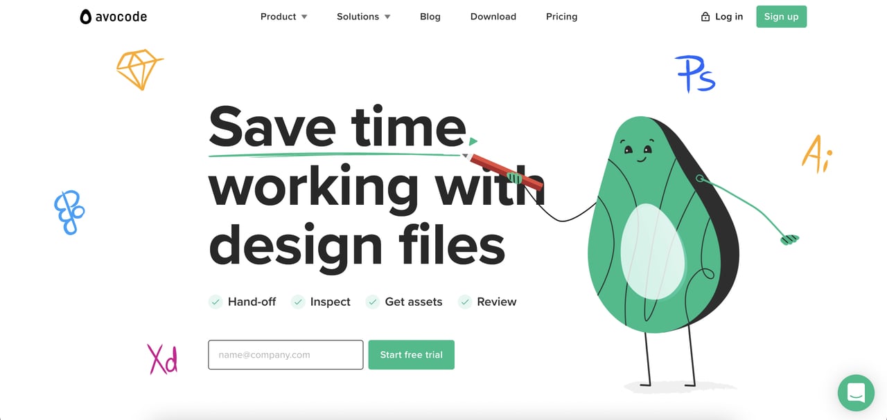
The first SaaS landing page example we’ll go over is Avocode’s, a design hand-off tool that lets you open, share, inspect, and collaborate on Sketch, Adobe XD, Photoshop, Illustrator, and Figma files.
All of these tools are shown on the landing page as sketched logos to give the visitors an idea of available products without putting them in a sentence.
Designers generally prefer straightforwardness in terms of formatting. A visitor should understand what your product does and what problem it solves at first glance. Moreover, it should include a compelling CTA, preferably above the fold, like Avocode’s “Start Free Trial” button.
Highlights
Use of white space: White space is the blank space on a page that’s deliberately left blank. It gives a more sophisticated image and leaves room for other page elements to breathe. Also, it maximizes the focus on the elements like CTA buttons and convinces visitors to convert. Avocode’s SaaS landing page does a great job with white space.
Social proof with brand logos: Social proof is one of the strongest cards in your hand for marketing your product. You can display the logos of renowned brands that use your software near the CTA button to boost user trust and convince them to hit the button.
Instructive & short product feature videos: Just like Avocode does, you can describe your highlighted product features and promote them with short videos next to the feature subtitles. (By short, we literally mean seconds.)
Customer testimonials: Placing short customer testimonials near each feature given on your landing page is a common marketing tactic you can also adopt.
CTAs at distinct locations: This LP has two CTAs, one at the top of the page and the other is at the bottom. It’s an excellent method to test both positions and see which one brings more conversions.
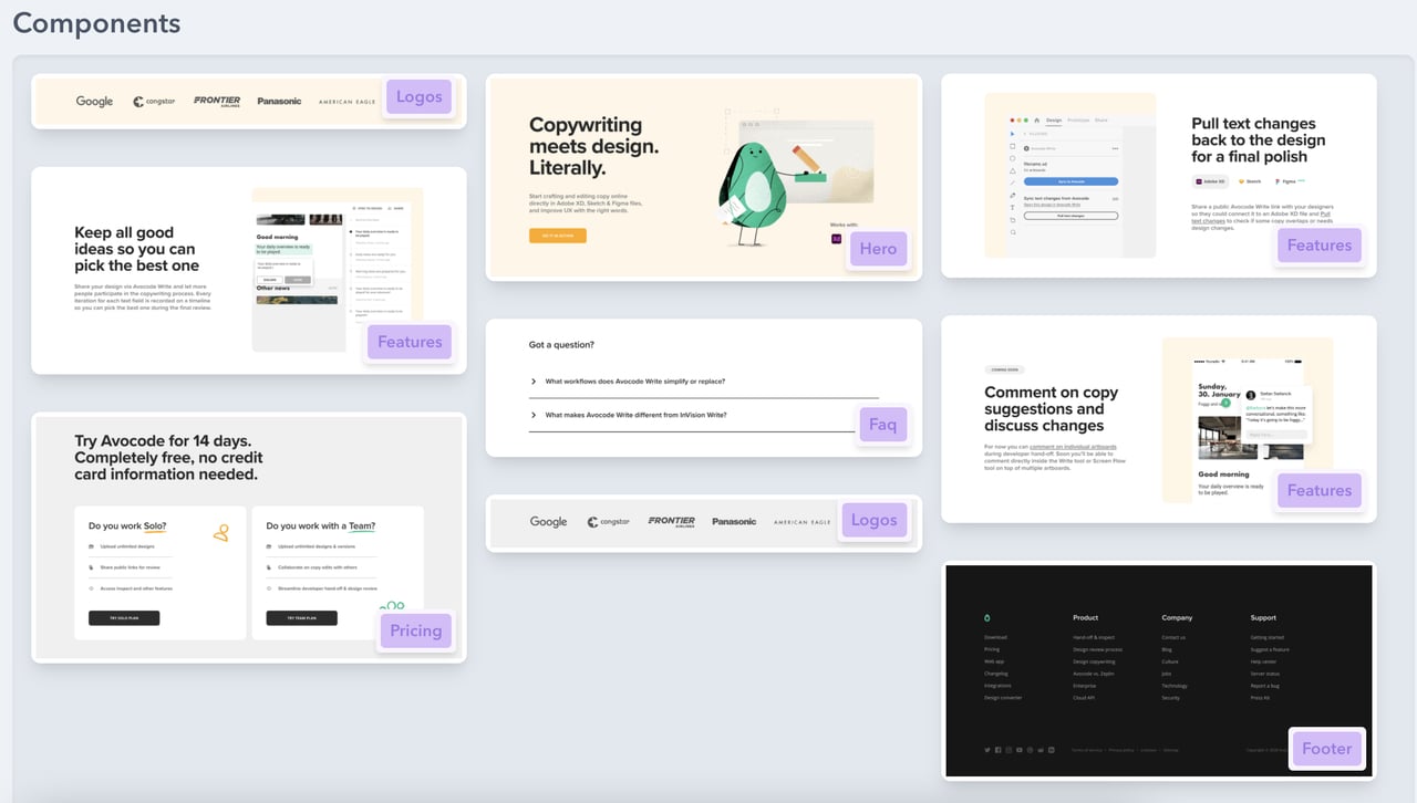
Components
(Source)
- Logos
- Features
- Hero
- FAQ
- Pricing
- Social proof
- Footer
2. Taskade
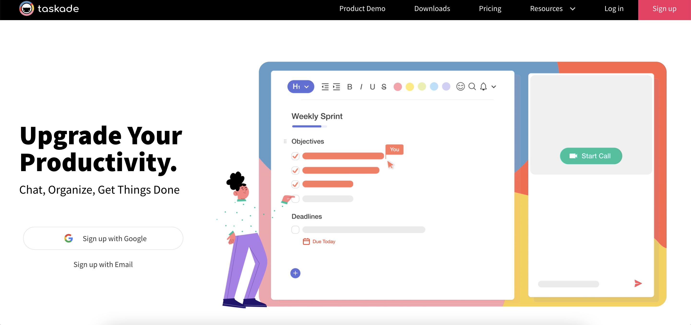
Taskade is a software as a solution designed to provide a collaborative task list with an unlimited hierarchy and help remote teams work in a unified workspace.
Highlights
Clear hero headline and description: This landing page has a 3-word headline, delivering the product value crystal clear. The product description is no different; it describes what the user can achieve with the software—Chat, Organize, Get Things Done. The fewer words, the better.
Two Signup options above the fold: Notice how the signup button on the top-right contrasts with the top bar menu. The page makes it easier for people to sign up by placing two options under the product description.
Colorful product demo: Taskade’s LP is full of product demos, and we’re digging it! These short demos work better than words as today’s user wants to see how the product looks and works before signing up.
Visual demo of each workflow: Streamlining your product workflows into steps with visual explanation helps users fully understand product capabilities.
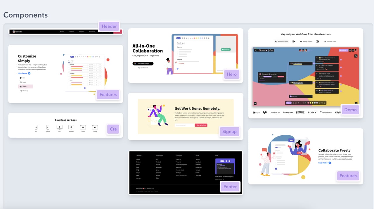
CTAs with icons: If your software is available as apps or extensions on multiple browsers and operating systems, you can hit all birds with one stone by using icon CTAs as in the image below.
Components
(Source: Landing Page Folio)
- Features
- CTA
- Signup box
- Demo
3. MeisterNote
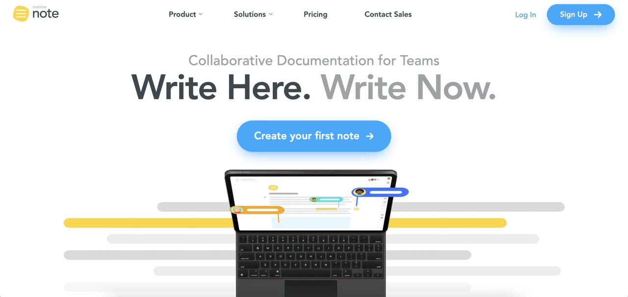
MesiterNote is collaborative documentation software for remote teams. Its landing page does an excellent job of simple product explanation in different forms, combining both visuality and texts.
Highlights
Clear CTA button above the fold: The primary CTA button’s color successfully contrasts with the background. Notice how it’s not “Sign up” but “Create your first note.” It prompts users to take action and matches with the headline “Write Here. Write Now.” And yes, it’s an excellent and punny headline.
Multiple CTAs: There are 8+ CTA buttons on this landing page; however, there are only 4 of the main signup CTA. MeisterNote simply leaves no room for missing the button. Multiple CTAs help you test the best position and catch the visitor’s eye in every scroll.
Highlighted integration options: As most users have more than one SaaS tool in their arsenal, providing more integration options with other third-party platforms is a big-time game-changer.
Privacy badge: If your product includes user data, display a privacy badge to gain customers’ trust.
Components
- Multiple CTAs
- Privacy badge
- Highlighted integrations
- Features
4. AirTable
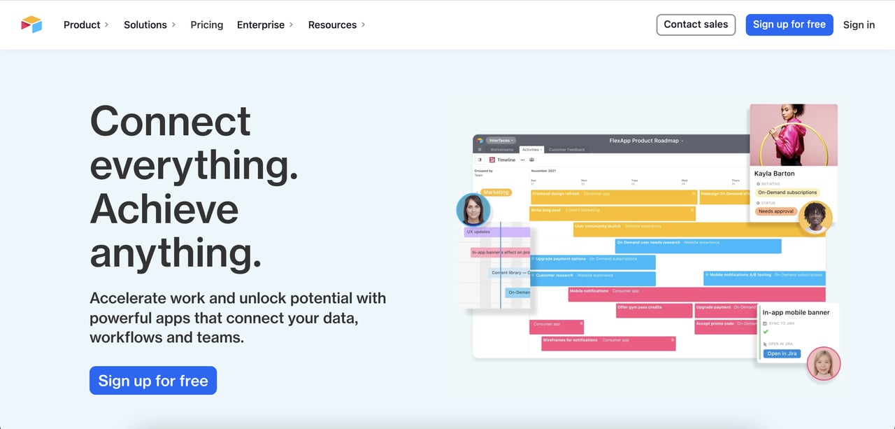
Next on our list of the best SaaS landing page examples is AirTable. It’s a low-code platform for building collaborative apps. This product might be a bit complicated for most users, but the landing page excels in streamlining the product proposition and features.
Highlights
Social proof with client brand logos: Many popular brands such as Medium and Netflix use Airtable, and this landing page showcases their logos to build trust.
Animated product demo: If you want to convey your product’s interface, capabilities, and features, animated demos are one of the best ways to do that.
Testimonials: This landing page places a single testimonial at the bottom section with a CTA link to the testimonial in video format.
Highlighted solutions explained visually: Airtable utilizes animated videos in describing product features and solutions as well.
Clearly delivered product value: The hero title is rhyming and clear about what the software offers, just as the description.
Components
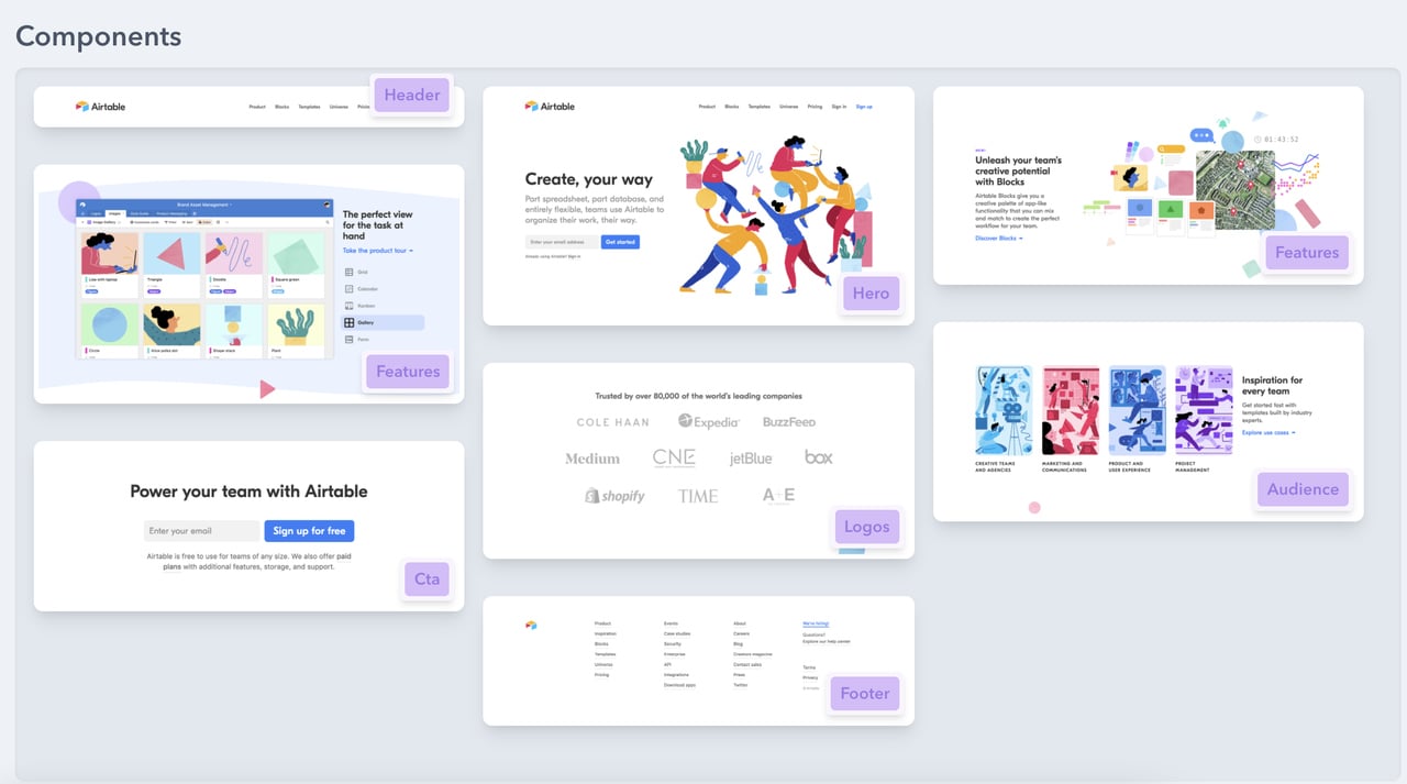
(Source: Landing Page Folio)
- Features
- CTA
- Audience
- Logos
- Footer
- Hero
5. Monday.com
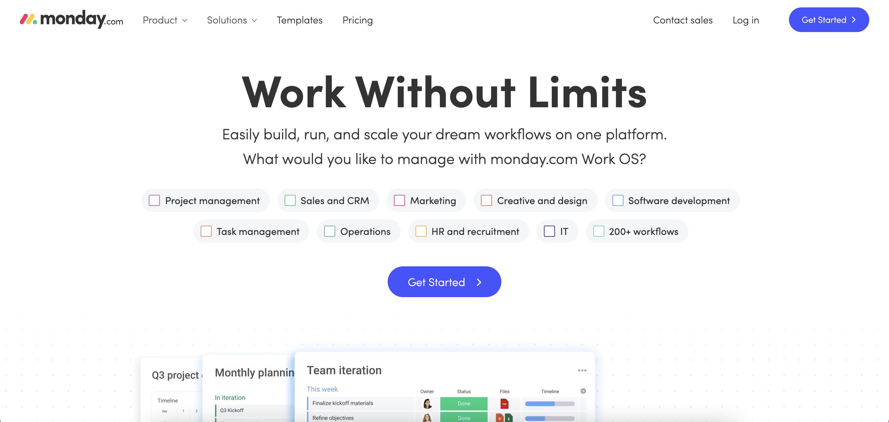
Monday.com is a work management platform that makes it easy for teams to manage projects collaboratively, as well as ad campaigns and more. What’s unique and creative about its landing page is how it turned its product capabilities into a task-looking format that you can check.
Highlights
Highlighted customer support: Users typically want to know they can quickly reach out to you for help. Highlighting your customer support on your SaaS landing page can actually get your product a step ahead.
Creative design: The task-looking format corresponds with the product flawlessly. Additionally, the overall design is simplified to eliminate distractions.
Client company logos: This landing page showcases client company logos near the call to action button to trigger conversions.
Short videos explaining product features: Just like most SaaS products in our list Monday.com uses short videos to explain product capabilities, features, and interface.
Integration options: Integration options are given with sliding platform logos.
Components
- CTAs at the bottom and above the fold
- Features
- Client company logos
- Visual demos
Also read 10 Landing Page Call to Action Tactics.
6. ActiveCollab
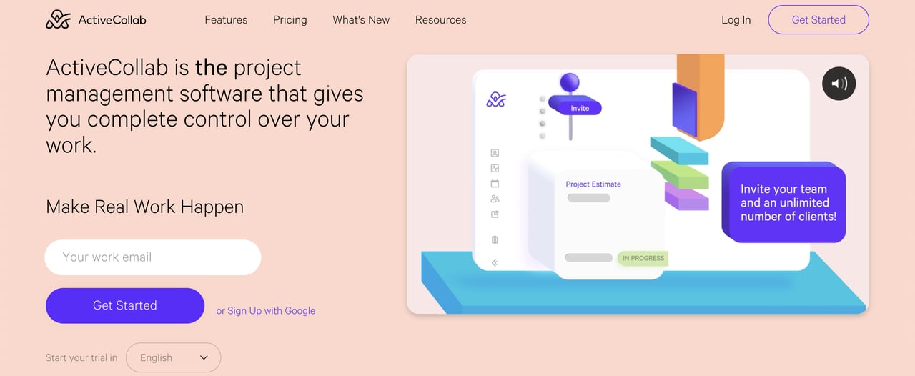
ActiveCollab is a project management software that centralizes all tasks, files, and projects.
Highlights
Language selection option: This landing page has a language option when starting the trial. It is placed just underneath the CTA button. It’s an amazing tactic to highlight your product’s multi-language option.
The number of teams that used the product: ActiveCollab displays the approximate number of teams that have used the software so far, as well as showcasing client company logos.
CTA button contrast: Selecting the right color palette for your landing page is an important part of its design because it may directly impact your conversions. It should present the company colors, and the colors should be complimentary. Moreover, CTA buttons should stand out with adequate contrast.
Bolded “The”: ActiveCollab’s hero headline is too long compared to industry standards. However, the strategic bolding of the preposition “the” is on point to emphasize their competitiveness.
Components
- Features
- Testimonials
- CTAs
- Footer
- Product demo video
You might also like 12 Best Landing Page Statistics You Should Know.
7. Maze
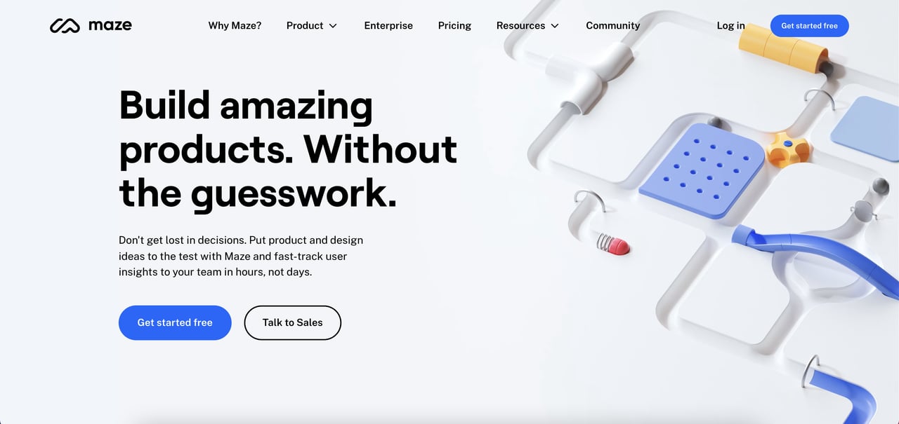
Maze is a rapid testing platform designed for product and marketing teams to test design projects based on Adobe XD, Figma, Sketch, InVision, or Marvel.
What catches the eye first on this landing page? The animations.
Highlights
Creative animations: Typically, SaaS landing pages use product demo animations. However, that’s not the case with Maze. They use the same-concept pinball animations throughout the page in a stunning way.
Side-to-side CTAs: While most landing pages place a single main CTA button above the fold, Maze uses two CTAs side to side. However, the good part is that the color difference cleverly shows the importance of hierarchy.
To the point: Both the headline and description explain the product offer and the problem it solves.
Highlights who can use it: Near the bottom of the page, Maze showcases who can use their product and to what end. This helps target the right audience.
Components
- CTAs
- Footer
- Testimonials
- Features
8. WeTransfer
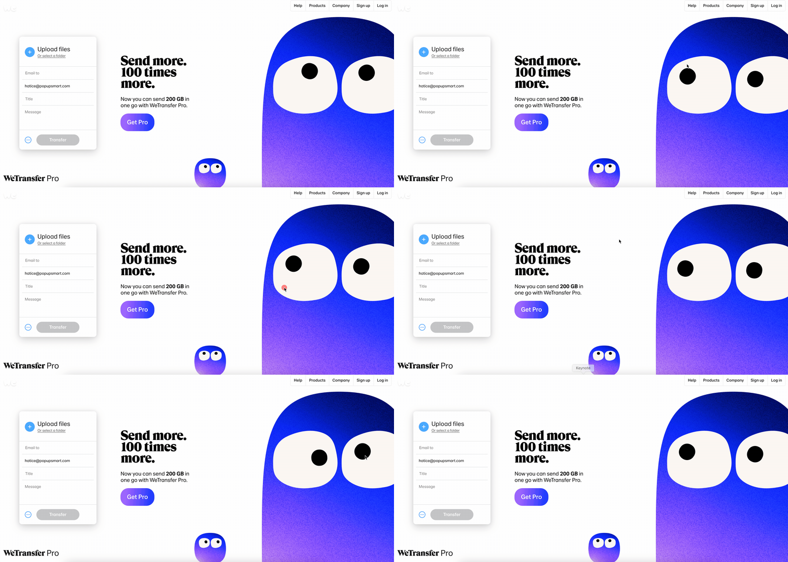
WeTransfer is a popular internet-based file transfer service. It streamlines, sending large files.
Highlights
Fun illustrations & animations: WeTransfer uses different and creative illustrations for its pages, and its landing page is no different.
No scroll-down: This landing page is a single page which makes it clearly focused and to the point.
Single-focus CTA button: There’s only one main upgrade CTa which is “Go Pro,” and it aligns with the color palette flawlessly.
Directly usable: This might not work for your product, but a visitor who lands on WeTransfer’s landing page can directly use the service for free without signing up. It proves how well the product works, so more users might go Pro for more GBs.
9. Asana
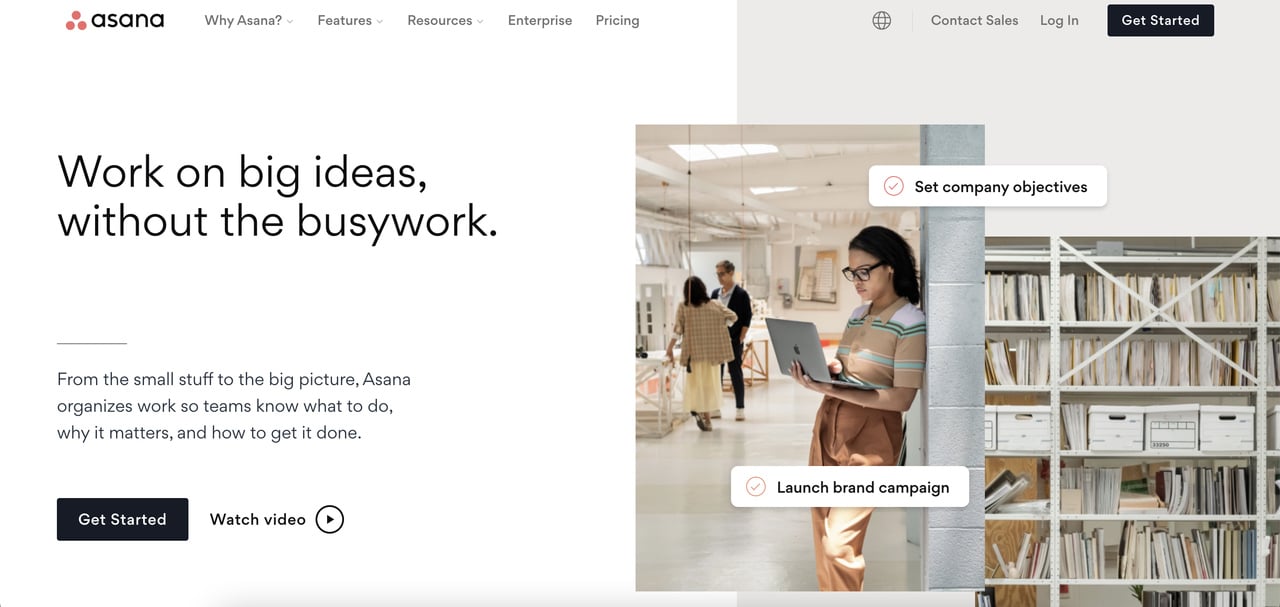
One of the best SaaS landing page examples is the popular work management platform Asana. In contrast to most brands in our list, this landing page uses a real human photograph in the hero section. This delivers the impression that real teams can easily use Asana to manage projects.
Highlights
Pull-away form: The format of this landing page works in a pull-away form, meaning the elements slide off once you start scrolling. It leaves more place for every other part below and looks satisfying to the eye.
Sliding integration options: Near the bottom of the page, an automatic slider showcases all the integration option’s logos with an arrow for each to direct users to relevant pages.
Components
- CTAs
- Footer
- Features
- Integrations
- Testimonials
Also read: Ecommerce Landing Page Examples.
10. Popupsmart
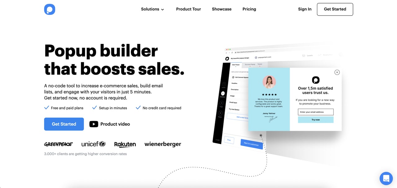
Popupsmart is a popup builder software designed to boost sales, signups, and conversions.
Highlights
Conversion boosters: Right below the hero description, Popuspmart draws attention to conversion-focused details such as “Free and paid plans,” “Setup in minutes,” and “No credit card requirement.”
Simple builder right inside the landing page: Similar to WeTranser's way of letting customers freely experience the service right on the landing page, Popupsmart implements a simple popup builder right into the page. Users can directly use the software with the simple builder for free.
Software demo animation: Once visitors scroll down the page, they meet the streamlined product demo animation.
Components
- Testimonials
- FAQ
- Footer
- Customer support
- Simple builder
Bonus SaaS Landing Page Examples
11. Miro
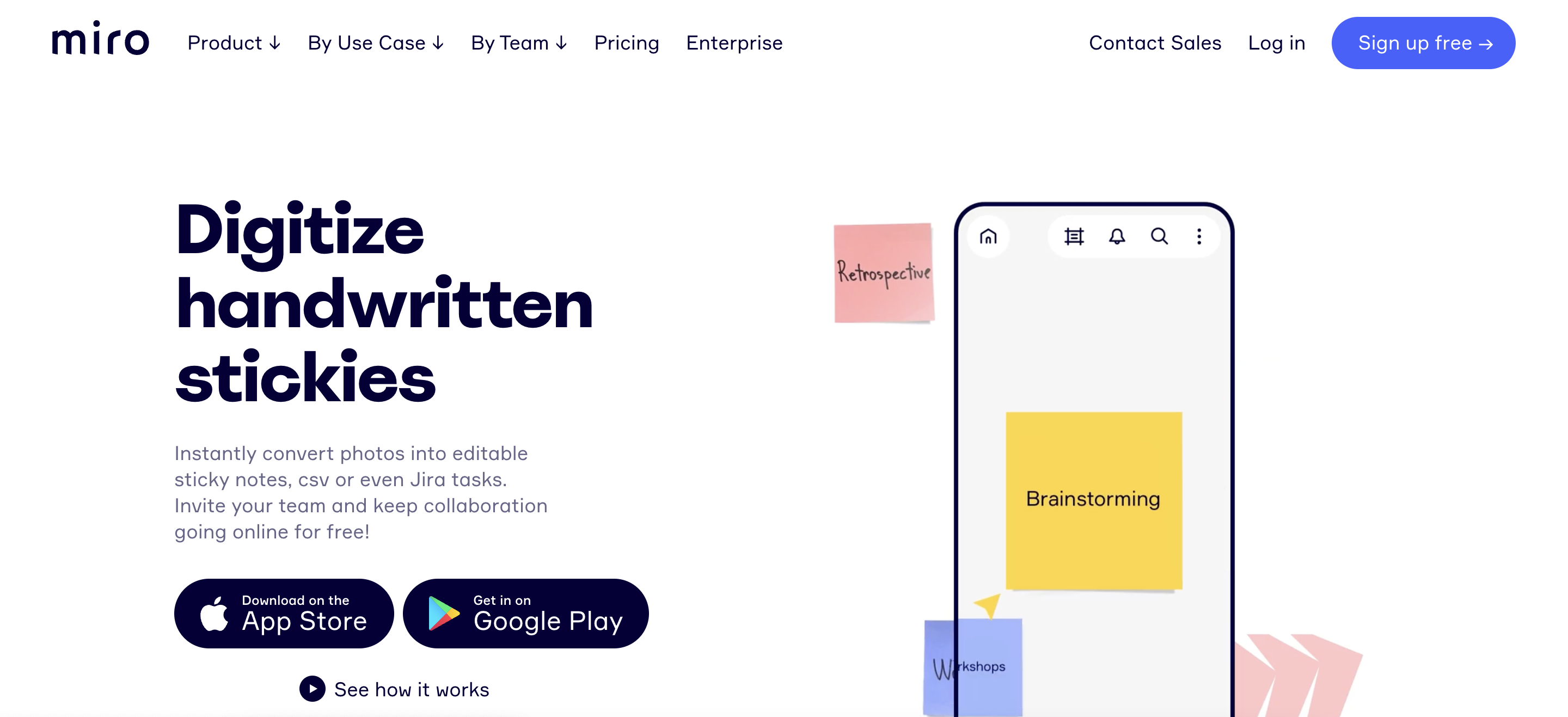
Miro Highlights
- Product demo animation
- Testimonials
- Streamlined list of top features
12. Figma
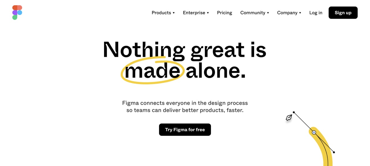
Figma Highlights
- Animated, changing hero headline
- Animated, slide-off features explanations
- Testimonials
- Community
13. Sketch
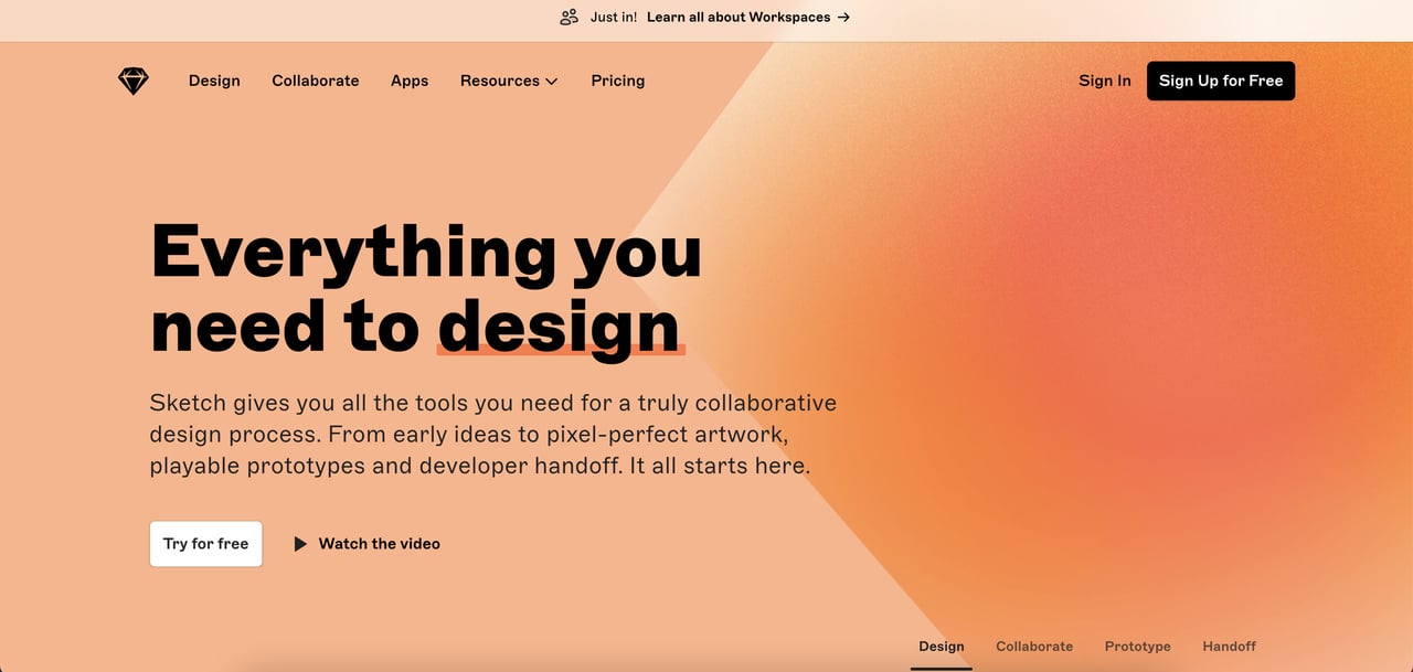
Sketch Highlights
- Animated product demo
- Animated top features explanations
- Testimonials
- Extensions slider
- Email signup form at the bottom
14. Vectary
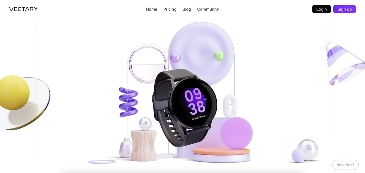
Vectary Highlights
- Product demo animation
- Pull-away form
- Clear design
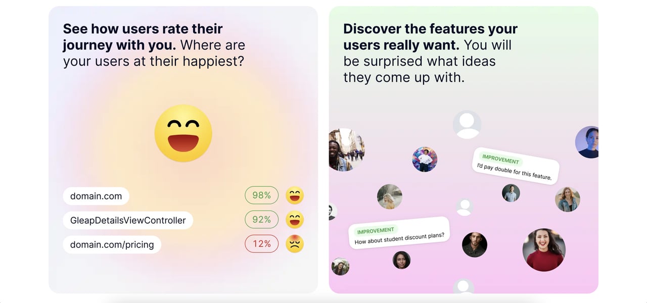
15. Gleap
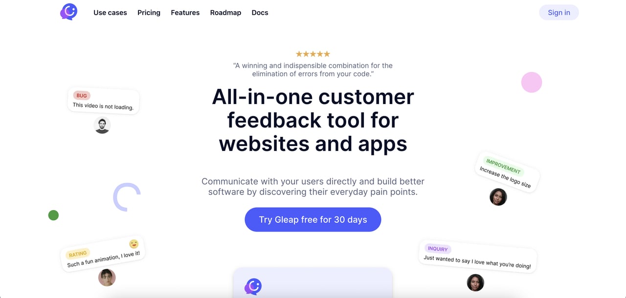
Gleap Highlights
- Feedback option
- Social proof
- Features
- Pricing placed at the bottom of the landing page
16. Glide
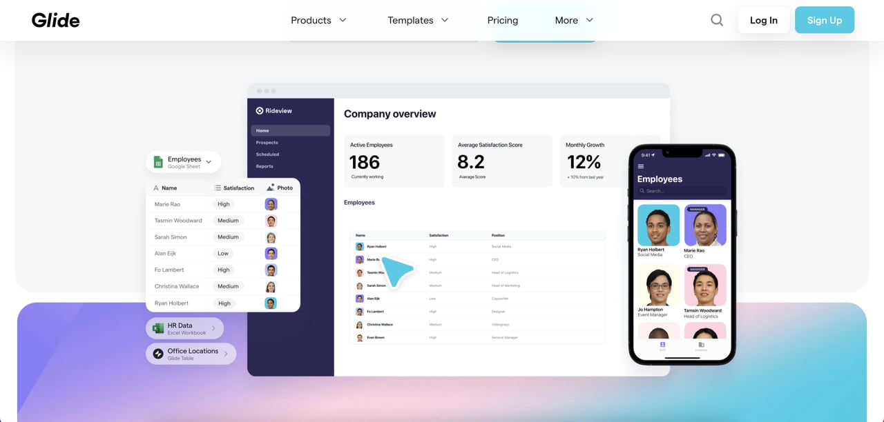
Glide Highlights
- Animated product demo
- Social proof
- Embedded product video
- Features
- Embedded product tutorial videos
17. MailChimp
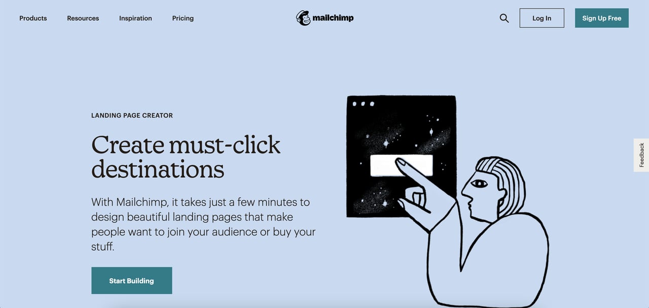
MailChimp Highlights
- Top features
- Links to resources at the bottom
- G2 award
- Testimonials
18. PandaDoc
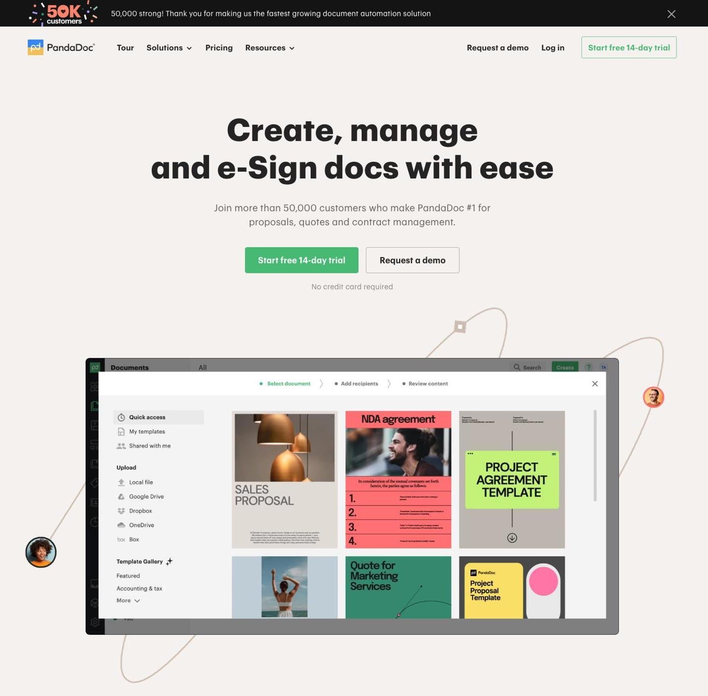
PandaDoc Highlights
- Social proof
- Top features
- A quick look at the product
- Links to resources at the top
19. Slack
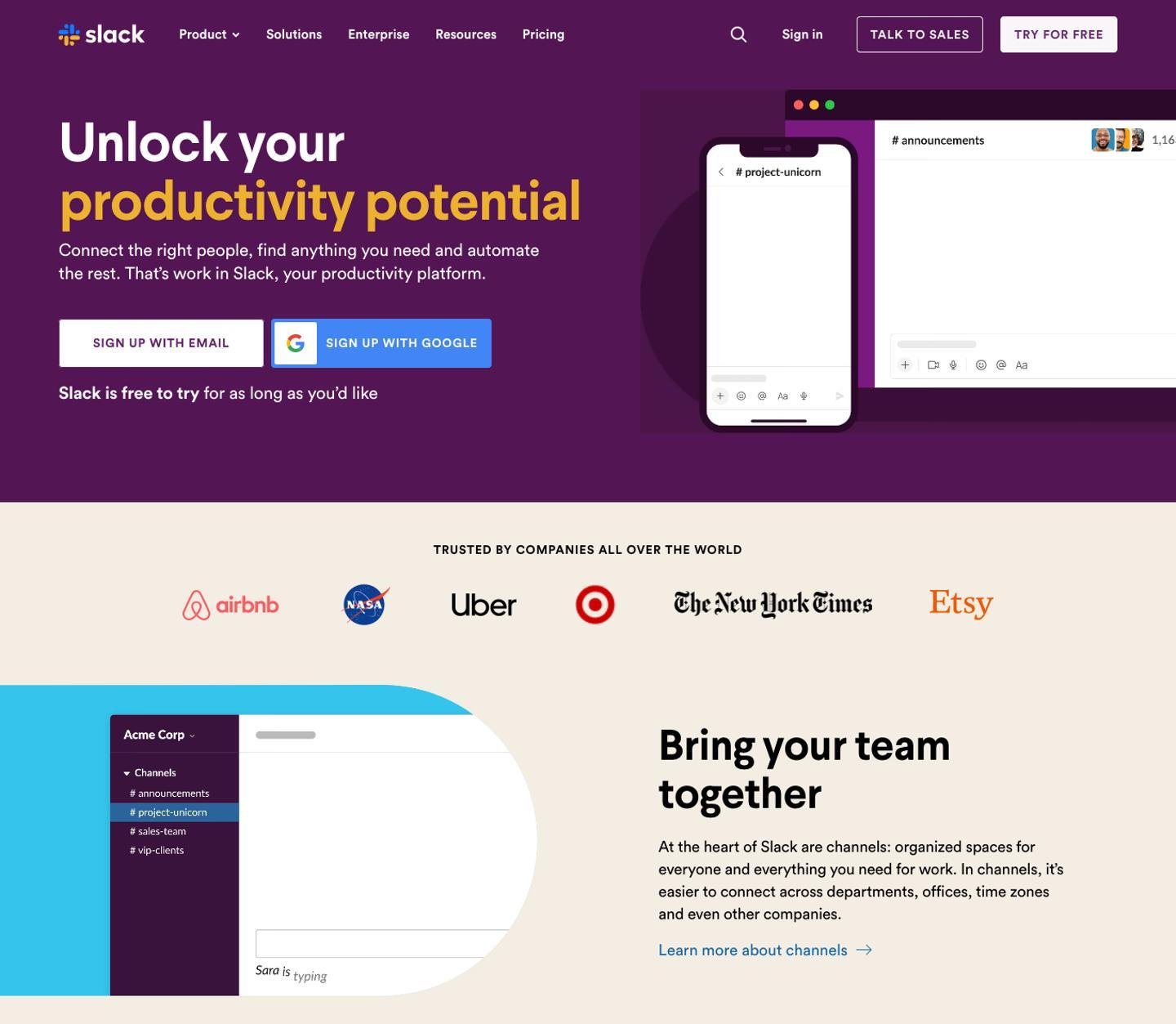
Slack Highlights
- The catchy headline grabs the attention
- Famous companies that use the product
- Features and links to their details
- Resources are given
20. Officevibe
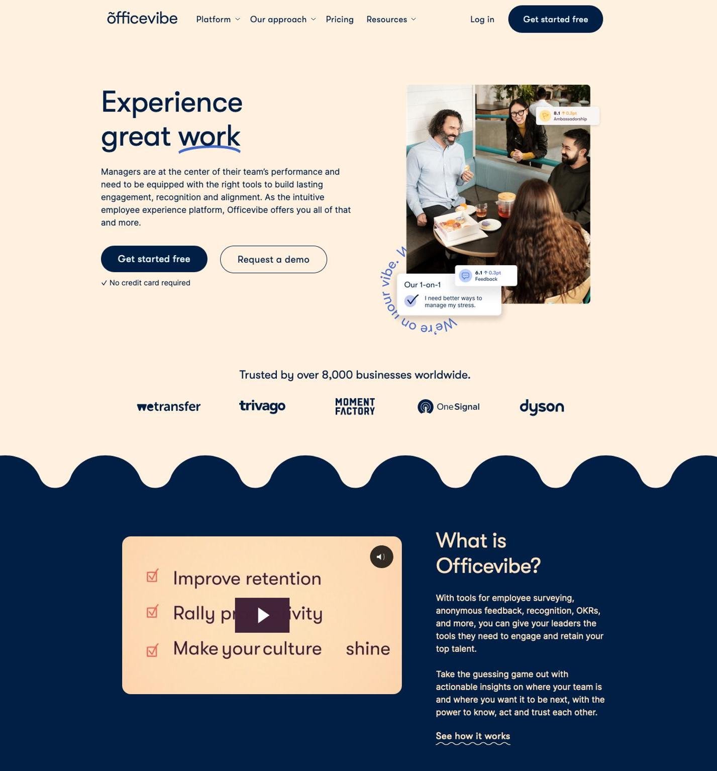
Officevibe Highlights
- Short & to the point headline
- Video with product details
- Businesses that use the product are added
- Platforms’ solution & approach at the top
Last Words
We mainly used three different resources for this blog post: LandingpageFolio, Lapa Ninja, SaaS Landing Page and SaaS Screenshots. You can check them out for more landing page inspirations.
You can use the code POPUP20 for SaaS Screenshots if you want to get access to premium features such as unlimited screenshots, unlimited filter & search results, unlimited bookmark, and email support. 🥳
We hope you liked our examples and got inspired for your next landing page design! Which one did you like the most? Share with us in the comments below.
Articles you might like:

.png)


