How to Read a Heat Map?
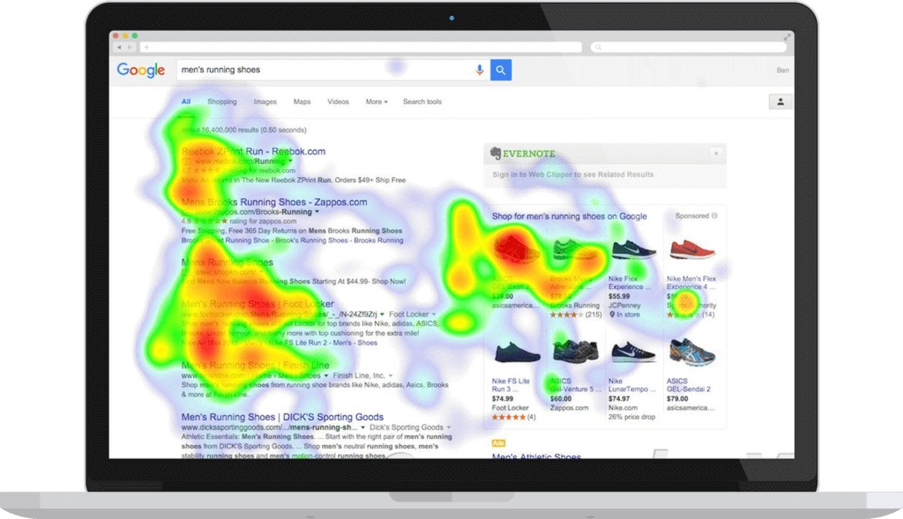
Reading a heat map depends on which data is represented on that particular map. Bear in mind that warmer colors indicate higher values and colder colors indicate lower values. Red is the warmest color and purple is the coldest in these maps.
You need to analyze colors and understand the intensity of the map. For example, in the image above, the intensity is the highest at the first 5 searches. This map shows us that the top 4-5 pages in a Google search get the most attention. Also note that the shopping part of the page is red because of the visual source.
Heat Map Generators
There are many websites that you can use to generate a heat map. Although there are numerous ways to analyze data, a heat map provides you with a visual and clear representation. It is useful for looking at your web page from a browser's perspective and customizing or replacing things in warmer and colder areas.
Related Articles
Conversion Rate Optimization (CRO): The Beginners Guide


