What is a Splash Page?
A splash page, sometimes referred to as a welcome screen or introductory page, is the initial page that users see before they access a website's main content. It serves as an effective tool in web design, coming in different formats - a full-page layout or a handy popup.
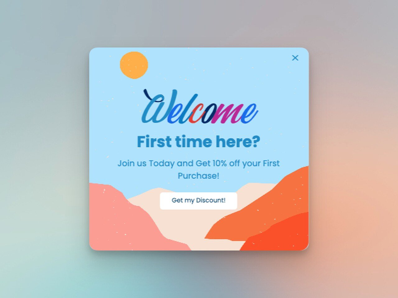
The essential elements of a splash page usually comprise:
➤ Engaging Visuals: High-resolution images, animations, or even videos work effectively to instantly grab user attention and set the tone for the website.
➤ Concise Messaging: This could be a compelling tagline, a brief introduction to the brand, or critical information that succinctly communicates the essence of the site.
➤ Action-oriented CTA: Call-To-Action buttons like "Enter Site," "Sign Up," "Choose Your Country/Currency" guide users to interact and proceed further into the site.
➤ Minimal Navigation: To maintain user focus on the main message or action, these pages often restrict other navigational options.
Let's consider a real-world example for better understanding.
Take this skim’s splash page as an example.
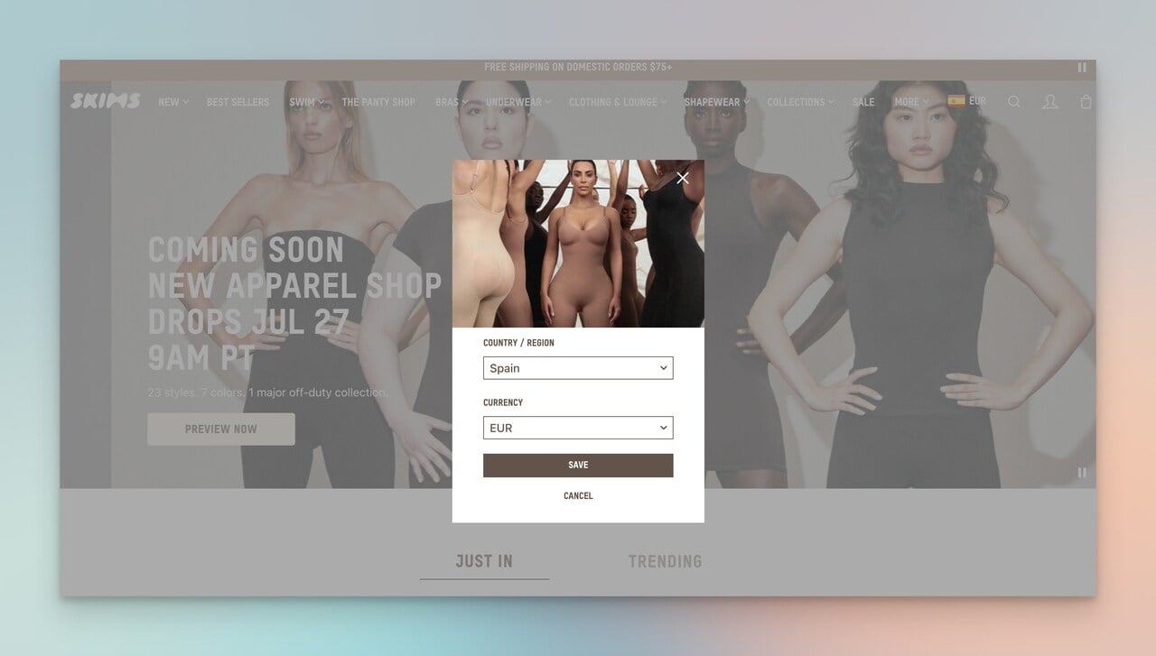
It displays a splash popup with a vibrant, high-quality image of its key star (the owner of the brand) and other models in all shapes and sizes.
The popup tried to facilitate the shopping experience and help them navigate their country and the currency. (We'll dig into more splash page examples soon)
This approach not only personalizes the shopping experience right from the start, but it also helps in localizing the product prices and shipping options.
What is the Difference Between a Splash Page & Landing Page?
A landing page is a specific web page designed with a single-focused objective, also known as a Call-to-Action (CTA).
It's the destination users arrive at after clicking a promotional link, often found in an email campaign, social media ad, or search engine marketing ad.
For instance, a landing page for a skincare brand might focus on their newest product, providing detailed information and customer reviews, with a clear "Buy Now" or a more creative CTA button for sales conversion.
On the other hand, a splash page is the initial page users encounter before accessing the main website.
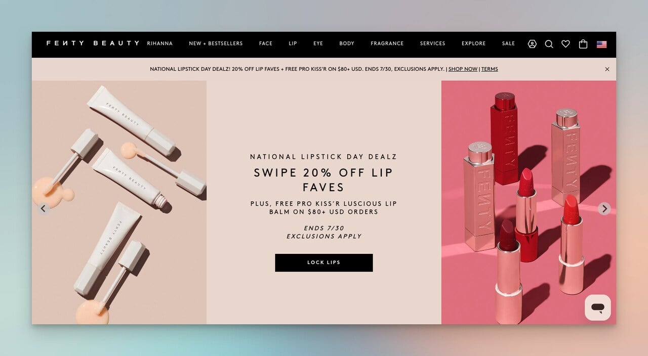
It's usually simple, containing minimal information and a single action, like "Enter Site," "Select Language," or "Verify Age".
For example, a wine retailer's website might first present a splash page asking visitors to confirm they are of legal drinking age before proceeding.
Differences between a splash page and a landing page lie in their design philosophy, content volume, and user interaction:
➤ Design Philosophy: Splash pages are designed as gateways to the main website, with limited content and interaction options. Meanwhile, landing pages are standalone pages created to drive conversions, equipped with detailed information about a specific product, service, or offer to encourage a particular action.
➤ Content Volume: While a splash page presents minimal content — a striking visual, brief messaging, and a CTA — a landing page is content-rich, providing comprehensive information to persuade visitors to complete the CTA.
➤ User Interaction: Splash pages generally require less user interaction, merely serving as an introduction or transition into the site.
Conversely, landing pages stimulate engagement, providing forms to fill, options to select, or detailed content to navigate through.
By understanding the distinction, you can deploy either a splash page or landing page effectively based on your website's needs and goals.
Why Choose a Splash Page Over a Landing Page?
Have you ever experienced the joy of popping bubble wrap?
That's similar to how visitors feel when a perfectly designed splash page pops up — simple, delightful, and instantly engaging.
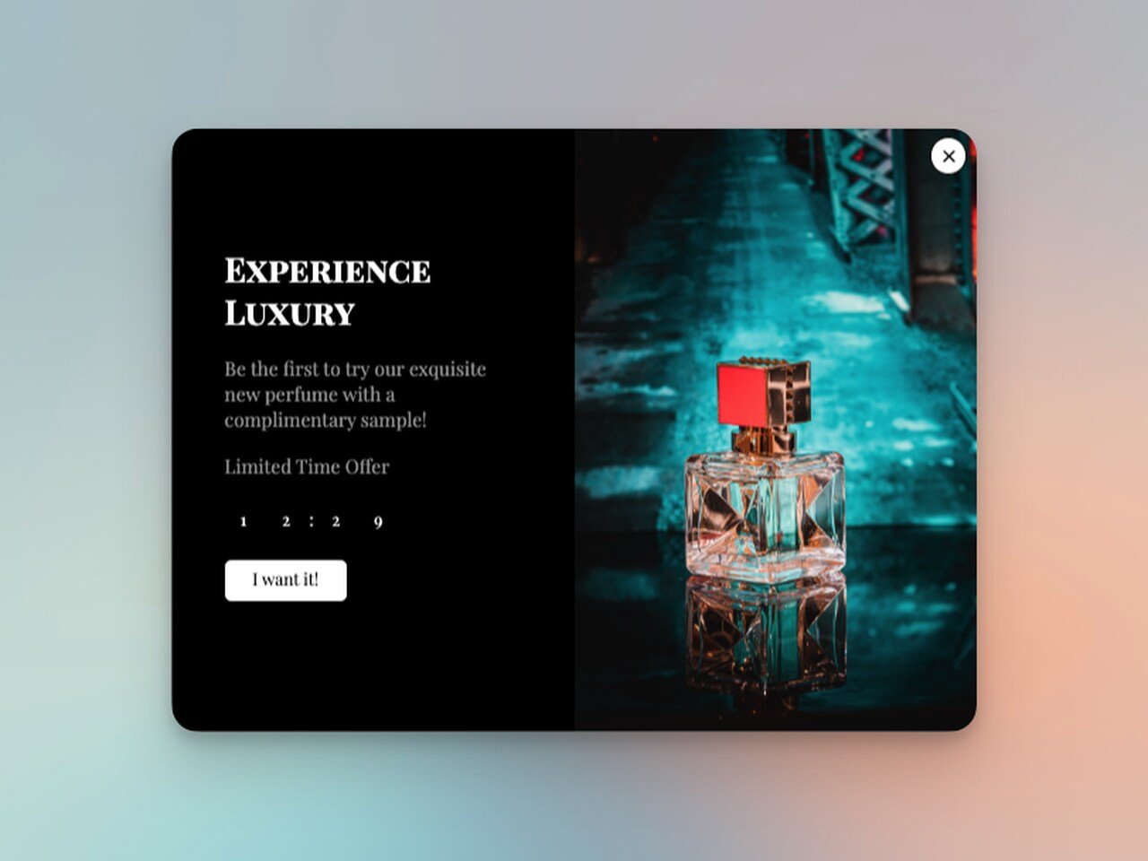
If you're steering the user voyage with swift announcements (like a new product launch or crucial updates), a splash page, like the example above, can be the ideal captain.
These splash popups are also handy for age verification, or gently guiding users to set preferences (language, region, or currency).
Here's why a splash page might win over a landing page in this digital beauty contest:
Simplicity: Imagine an exquisite, minimalist painting, saying a thousand words with a few strokes. That's a splash page for you! With its clean design and streamlined content, the user gets the message or completes the intended action in a jiffy.
Personalization: Splash pages are like bespoke suits, made to measure. They tailor the user's experience from the get-go, setting language or currency preferences. It's like a warm, personalized welcome mat rolled out for every visitor.
Immediate Announcements: If you've got hot news, why make your users dig for it? A splash page is your town crier, broadcasting important information or updates right at the entry.
So, when you're weighing the scales between a splash page and a landing page, remember this: a well-crafted splash page, particularly a popping popup, can provide an elegant, user-friendly, and efficient way to interact with your users.
They're the bubbly greeters of the digital world, making user journeys as delightful as... well, popping bubble wrap!
How to Create an Effective Splash Page?
Creating a splash page that not only looks good but also performs well can be like threading a needle – it requires precision, focus, and practice.
Here are some practical tips to help you stitch together an impressive splash page:
1. The Minimalist's Manifesto: Less is More
Your splash page should be clean and uncluttered. Stick to the bare essentials: an eye-catching visual, a brief but impactful message, and a clear Call-to-Action (CTA).
Think of it as an elevator pitch for your website; you have only a few seconds to captivate users, so make it count!
Consider this captivating example from Starbucks: their splash page features a vibrant, refreshing image of their new summer concoction.
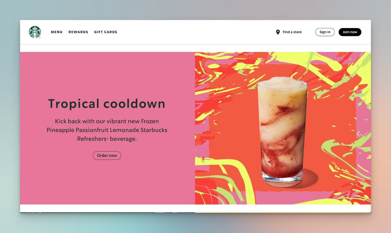
The radiant hues of the beverage, reminiscent of a sunny day at the beach, immediately grab your attention.
Complementing this visual treat is a CTA button that simply states, "Order Now".
What makes this splash page shine? It's a harmonious blend of simplicity, minimalism, and strategic promotion.
The page is as straightforward and inviting as a summer breeze, focusing solely on their new product.
The combination of alluring imagery and a clear directive to "Order Now" entices visitors to try this summer delight, effectively driving product awareness and potential sales.
2. Say It With Pictures: Visual Impact
Use compelling visuals to capture user attention.
Whether it's a high-quality image, a vibrant animation, or a short video, ensure that the visual aligns with your brand and complements the message.
Look at this Hugo Boss's splash page, a study in simplicity and elegance.
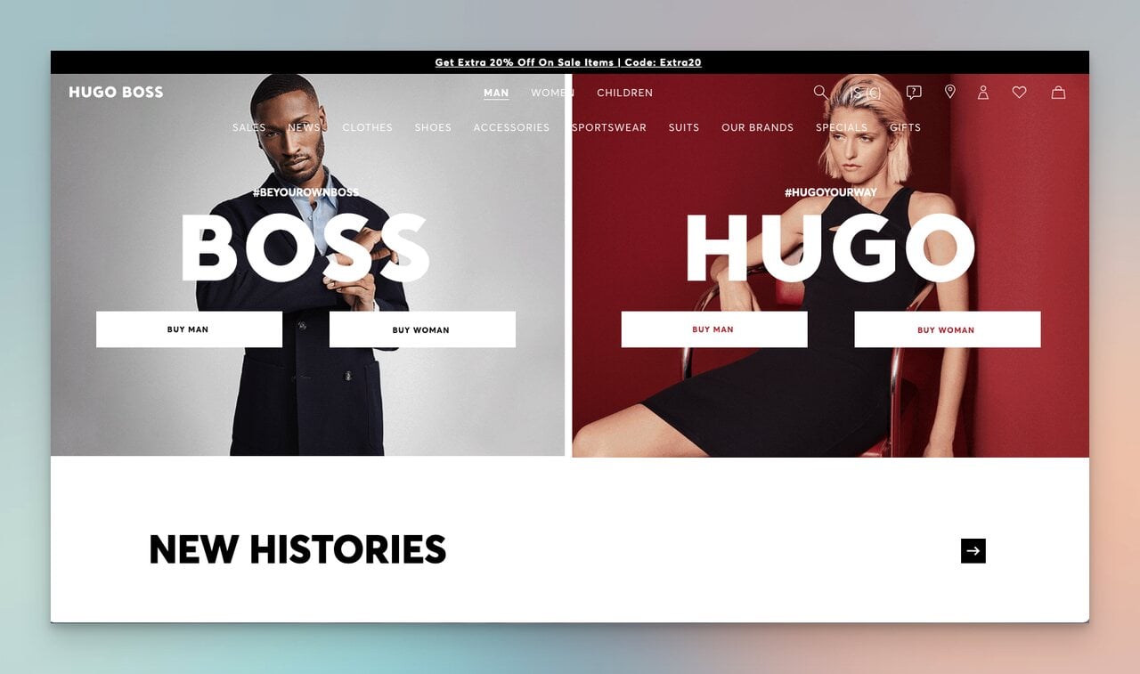
It features a dynamic slideshow of models, presenting an enticing glimpse of their high-fashion attire.
The page's brilliance lies in its paired-back CTAs: "Buy Man" and "Buy Woman."
It's a seamless blend of style, easy navigation, and perfect visualization.
In essence, Hugo Boss doesn't just sell products via their splash page - they offer a luxurious shopping experience that aligns perfectly with their brand persona.
3. Speak Up: Craft Your Message
A splash page is your website's elevator pitch - it needs to succinctly convey your value proposition and why it matters to users.
Take a leaf from Basecamp's book.
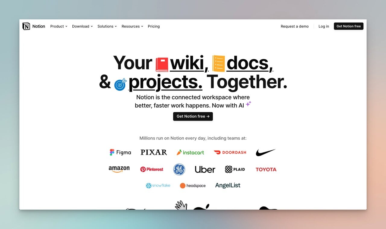
Their splash page adeptly aligns with their overall branding, spotlighting two engaging cartoon characters discussing the product's productivity and impact.
It's not just a conversation; it's a lively, visual representation of their tool in action.
And then, there's the tagline: "Where it all comes together."
In just five words, it encapsulates the brand's essence, emphasizing its promise to streamline workflow & accelerate progress.
The call-to-action is the cherry on top: "Try it for free, enjoy work more."
This invitation not only prompts action but also suggests a positive outcome (AKA value) - a more enjoyable work experience.
It's a masterclass in creating a compelling, persuasive splash page message.
4. Direct the Journey: Clear CTA
Clear and actionable CTAs guide users, but they should also convey value.
The era of ultra-short CTAs has evolved, making room for creativity and a focus on what users gain from clicking.
Emotional triggers still have their place, but they now share the stage with the promise of value.
For instance, a CTA stating "Buy Now" might be less effective than "Secure Your Spot - Start Learning Today!" The former is purely transactional, while the latter emphasizes the value proposition, presenting a benefit to the user.
Consider this splash popup template as an example:
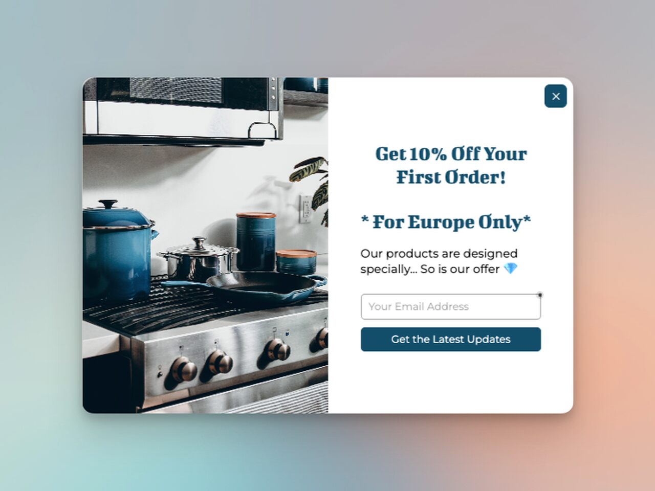
The message grabs attention with a tempting offer - a 10% discount on the first order.
The regional specification adds a personal touch, making European customers feel seen.
The CTA, "Get the Latest Updates," cleverly provides value by offering the latest news and, potentially, more exclusive deals.
The entire messaging suite and CTA work together to guide the visitor on a value-driven journey.
5. Tailor the Experience: Personalization
In the vast ocean of the internet, personalization is your lifeboat.
It enables your site to stand out and resonate with users on a deeper level.
If your audience is diverse, personalization is even more crucial.
A well-crafted splash page is your first step towards personalizing the user experience.
Look how Kylie Cosmetics leverages the splash page popup to let users select their country and preferred currency.
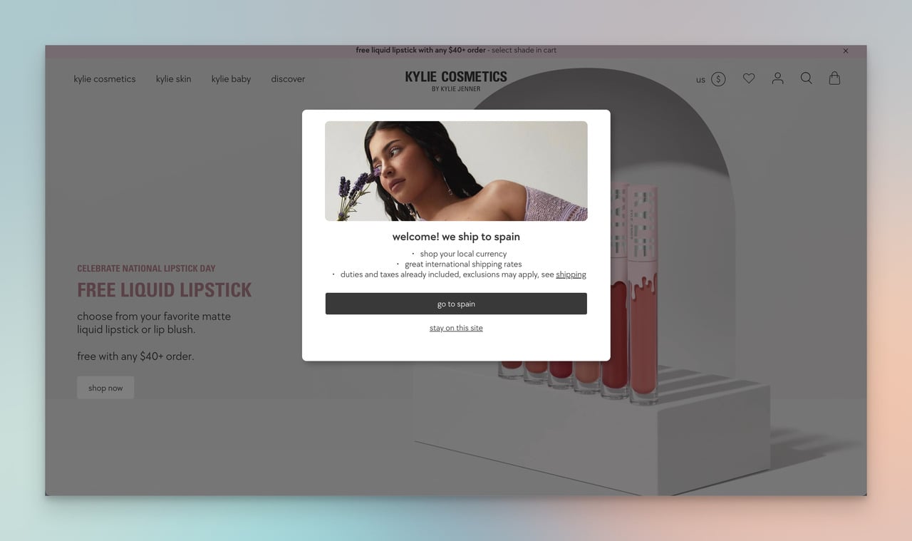
But that's just the start. Depending on your business and audience, you can offer language options, display region-specific content, or even remember user preferences for future visits.
Personalization isn't just a buzzword; it's a tool to make your splash page more effective and your users more engaged.
Tailor the experience, and your users will thank you with their loyalty.
💡 Get Personal With Best Website Personalization Tools
6. Test, Tweak, Triumph: Optimize for Performance
Creating a splash page is not a one-and-done deal; it's an ongoing process of evolution and refinement.
To maximize its effectiveness, your splash page needs to be a living entity that constantly adapts based on data, feedback, and performance metrics.
Regular testing and optimization should be a core part of your strategy.
Experimentation is your best friend here - play around with different visual elements, tweak your copy, and adjust your CTAs.
Each change, no matter how small, can have a significant impact on your conversion rate.
Monitoring user interactions is key. Look at your analytics:
Which elements are users clicking on?
Where do they spend the most time?
How many bounce away quickly?
This data offers insights into what's working and what's not, guiding your optimization efforts.
Additionally, consider A/B testing. By creating two versions of your splash page with a single variation between them (e.g., different CTA wording), you can see which one performs better.
Remember, the goal isn't just to create a splash page but to continually refine it until it's a high-converting machine.
Inspiration Awaits: Best Examples of Splash Pages
You've learned the art and science of crafting a high-performing splash page. Now let's dive into the deep end and explore some exceptional examples that are leading the way. Let these inspire your own creation.
1- Zara: Simplicity in Style
Zara stands for minimalistic elegance, and its splash page is no different.
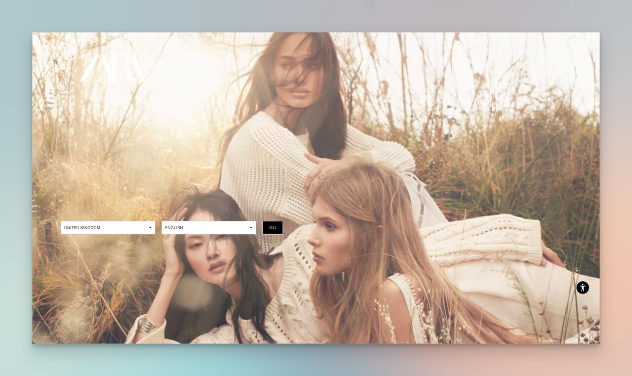
It elegantly asks users to choose their country and language, ensuring a personalized shopping experience.
The background image grabs attention, subtly highlighting key products.
The options are neatly tucked under a drop-down menu, preventing information overload.
The simplicity of Zara's splash page exudes its brand ethos and keeps visitors focused.
2- Lego: Directing the Play
Lego's navigational splash page is a fun invitation to explore its online store or jump into the play zone.
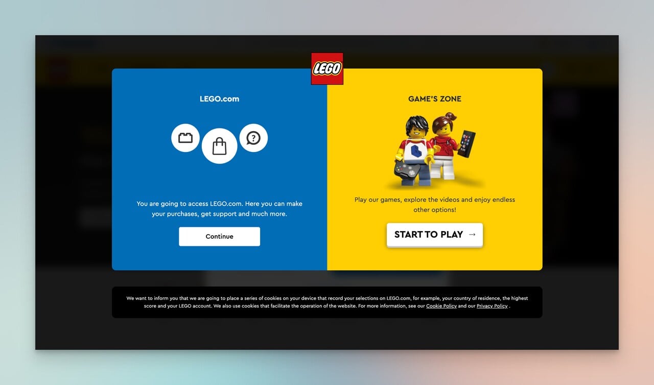
No sales pitch, just helpful direction.
The vibrant CTAs are like Lego blocks themselves - colorful, inviting, and straightforward.
3- H&M: Transparency in Navigation
Unlike Zara, H&M showcases all options. Each country has a language translation alongside it, easing the visitor's selection process.
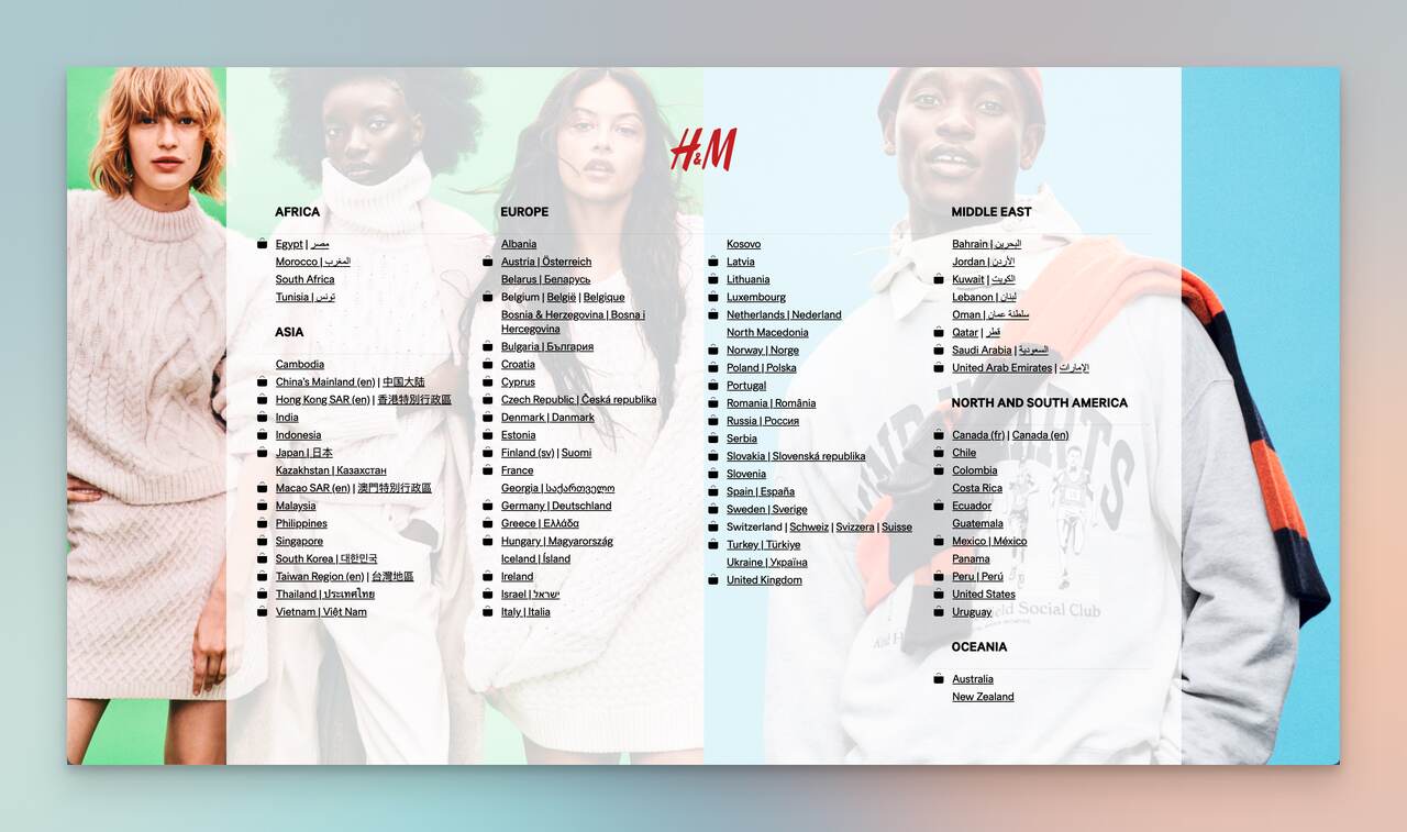
The semi-transparent layer overlays their brand imagery, effectively showcasing their products while the visitor chooses their preferences. It's a fine balance of identity and customization.
4- Gap: Personalized Discounts
Gap welcomes first-time visitors with an enticing discount popup.
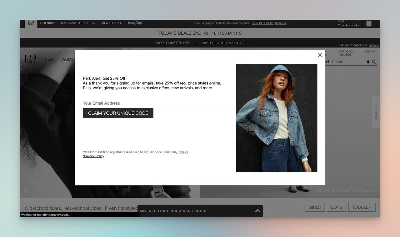
Featuring an appealing model in Gap attire and offering a 25% discount, they make the visitor's initial journey special.
The CTA, "claim your unique code," adds exclusivity, and collecting emails ensures they stay in the loop for future offers.
6- Banana Republic: Stylish Savings
Banana Republic's splash page is an elegant strategy to grow their email list while promoting their style and products.
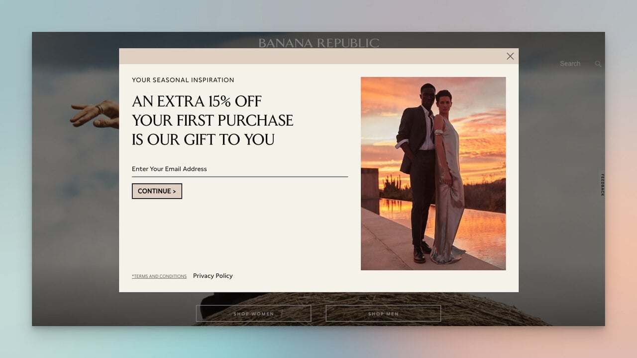
Offering a 15% discount on the first purchase persuades visitors to convert.
It's tasteful, matches the brand's aesthetic, and elevates the first-time visitor experience without compromising the brand's standards.
The Splash Page Journey: Wrapping Up
In the world of digital interaction, first impressions matter.
Remember, the key to an effective splash page lies in understanding your audience, aligning with your brand identity, and, of course, a healthy dose of creativity and experimentation.
Use bold visuals, craft concise messages, implement clear CTAs, and offer personalization to enhance your user experience.
Inspired by our examples?
Now it's time to bring your vision to life.
Experiment with Popupsmart's wide range of splash page popup templates and create your own mesmerizing digital welcome mat.
Keep the tips and examples from this guide close to heart, and you're all set for success.
Frequently Asked Questions

1. How Does a Splash Page Enhance User Experience?
A splash page enhances user experience by immediately engaging users, providing essential information, or tailoring experiences based on user preferences.
2. When Should I Use a Splash Page Instead of a Landing Page?
Use a splash page for immediate engagement or quick announcements. For detailed product information or lead generation, use a landing page.
3. Can Splash Pages Improve My Site's SEO Performance?
Yes, include relevant keywords in your messaging or CTA. But, always monitor performance to ensure your splash page aligns with your overall SEO strategy.


